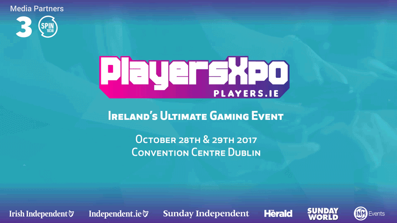
PlayersXpo Logo
Website: Players.ie
Through my day-job (in-house designer), I was specifically approached to create a lettering logotype for the PlayersXpo gaming conference in Dublin, Ireland. The client wanted something unique, ” A font or style that anyone else can’t just buy and use” was the main request by the client. They knew lettering logos is what I specialise in outside of my day-job which is why they requested me to work closely with the team in terms of creating branding and consulting on what would work best for the design for specific demographics.
The design must cater for families with young kids and must be instantly recognisable among other logos in its industry/market. This gave the project a sense of direction instead of something ambiguous. Games industry design has tendencies to lean towards pre-established standards when it comes to demographics and its respective market i.e. Mobile games go to the same cartoon-like display typography (see the Clash of Clans, Candy Crush logos) for example.
For this, the gaming exhibition market space, logos are a tame affair, both internationally and nationally (within Ireland) with most logos opting for simple type design, ie. typing the name of a conference and using it as a logotype with perhaps a simple icon.
But that’s not what I opted for.
Inspiration and Process
Early in the briefing stage, it was mentioned that badges may be a direction to go in. So began sketching badge ideas in similar style to sports logos, an illustration accompanied with a banner with thick, distinctive display font, similar to Fraser Davidson style sports logos (FieldTheory). The logotype would draw inspiration from 80’s type that was used in gaming logos, such as Ubisoft’s logo, and classic pixel type. While the logo aimed to keep true to traditional gaming influences, the aim was to inspire it with more modern pixel / block typefaces, ie. Minecraft, Twitch.
Through exploring these styles, here is the final result of sketching;
![]()
![]()
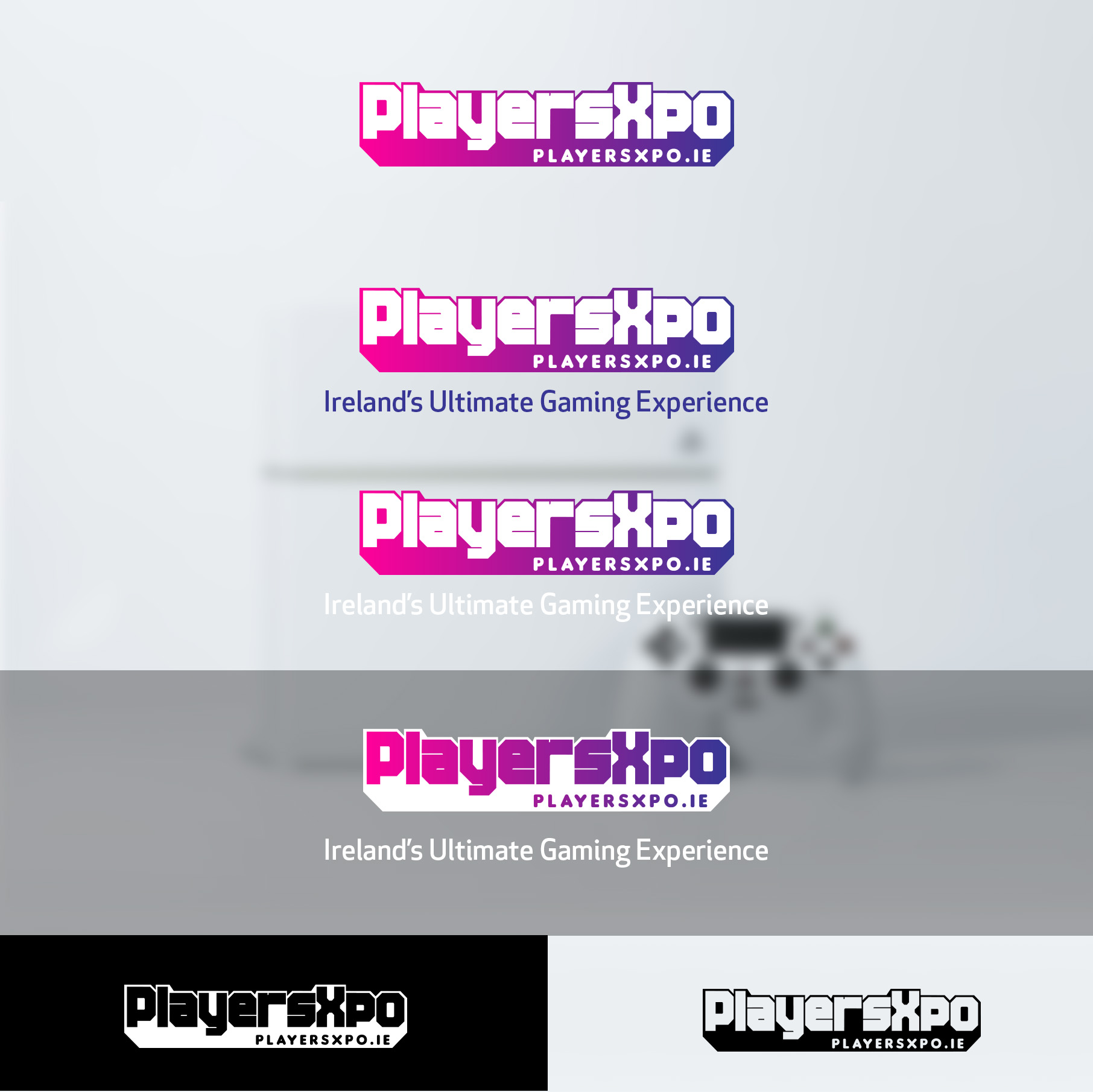
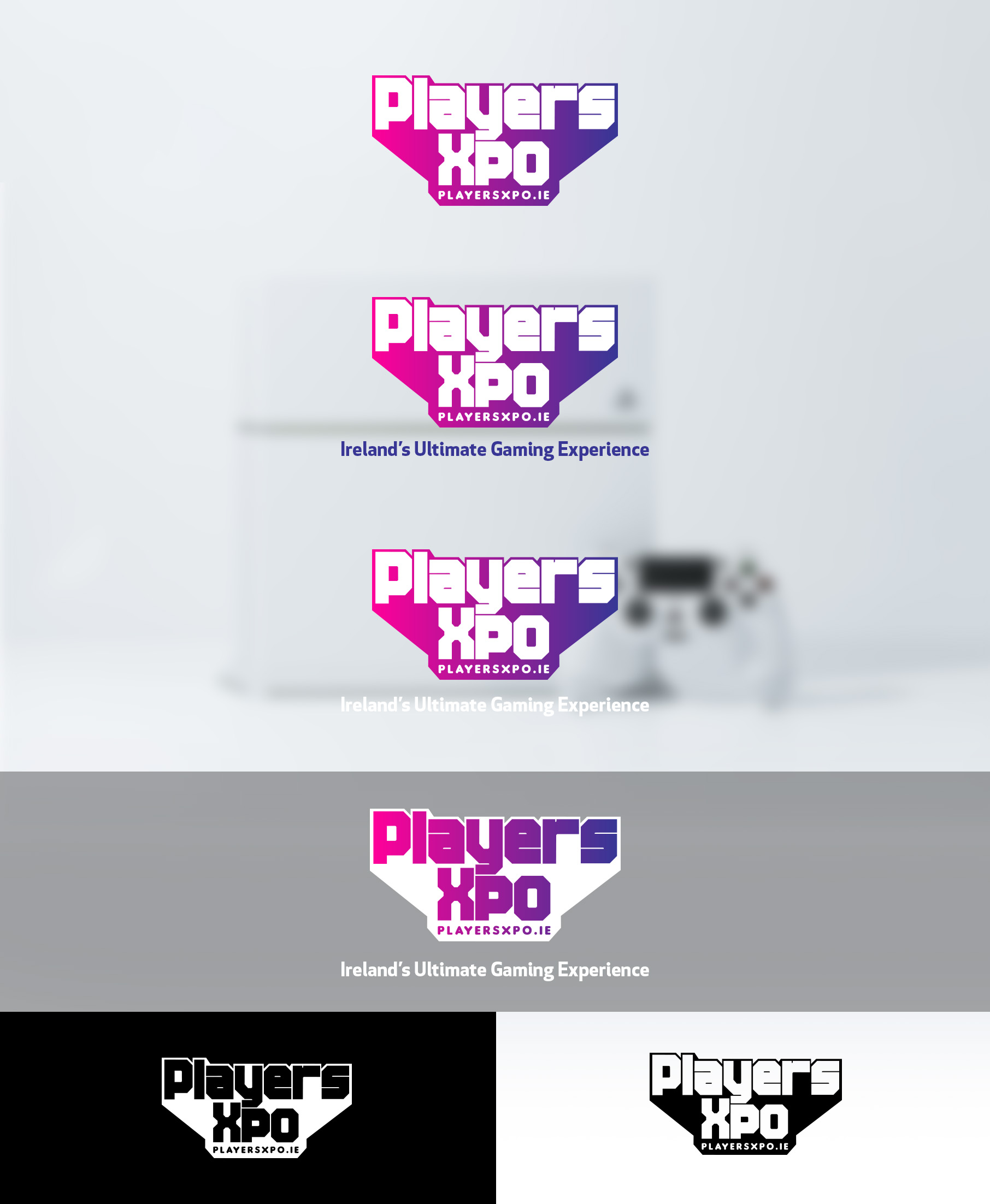
A horizontal and stacked version. The logo represents a classic throwback to pixel typography while also bolstering a 3D space. The logo is grid based in homage to the classic pixel-art style graphics of the retro-gaming era and utilises right angles to create its shape. Subtle details added to the piece including rounded edges on the inner parts of the type, i.e. the inside of the ‘P’, add to the personality and distinction of the overall logotype, giving it its on uniqueness as requested by the client.
The PlayersXpo logotype is made entirely by hand.
The underlying tagline built into the logo is a result of generating a direction for people to go if interested in the event without guessing. The idea being that there is a CTA (Call-to-Action) no matter where or with what context the logo appears.
The text for this tagline had to be distinct enough to stand out, yet not be crowded out or crushed by the overlying text (the logotype itself). ‘Sans’ and ‘Serif’ style fonts were too harsh and detracted from the logotype because of their harsh edges and generally did not fit in with the design. The alternative was to explore rounded edge type, something softer that would compliment the logotype.
The gradient colour affords the logo a sense of movement and explores traditional demographic colours enforcing that the conference caters to many diverse people, from young audiences to old, and to both men and women. And also looks cool af.
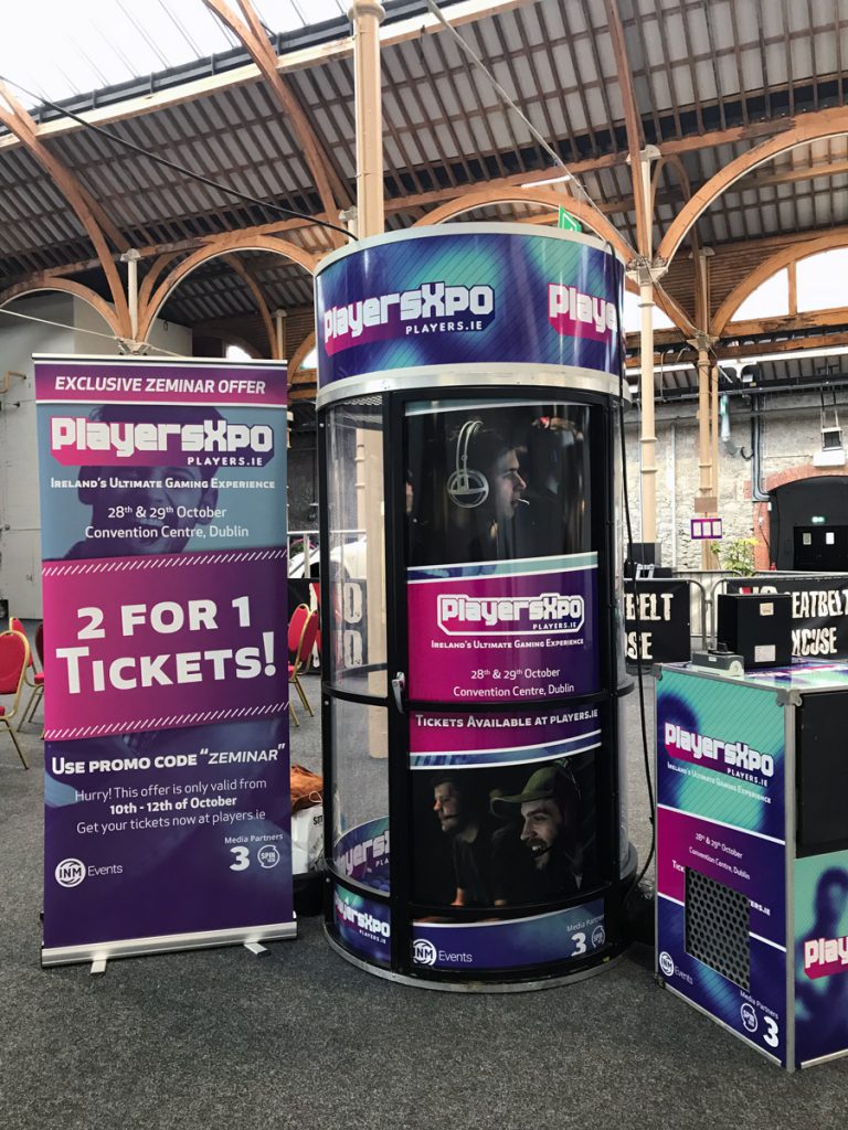
The branding sheet showing the options for the logo and how it is to be used when in different environments;
Branding
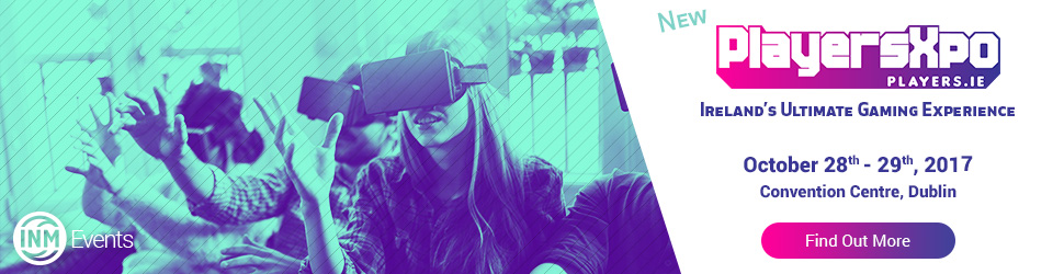
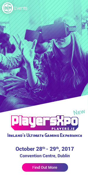
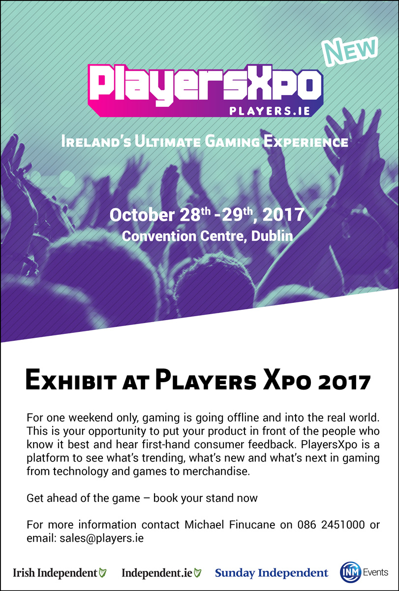
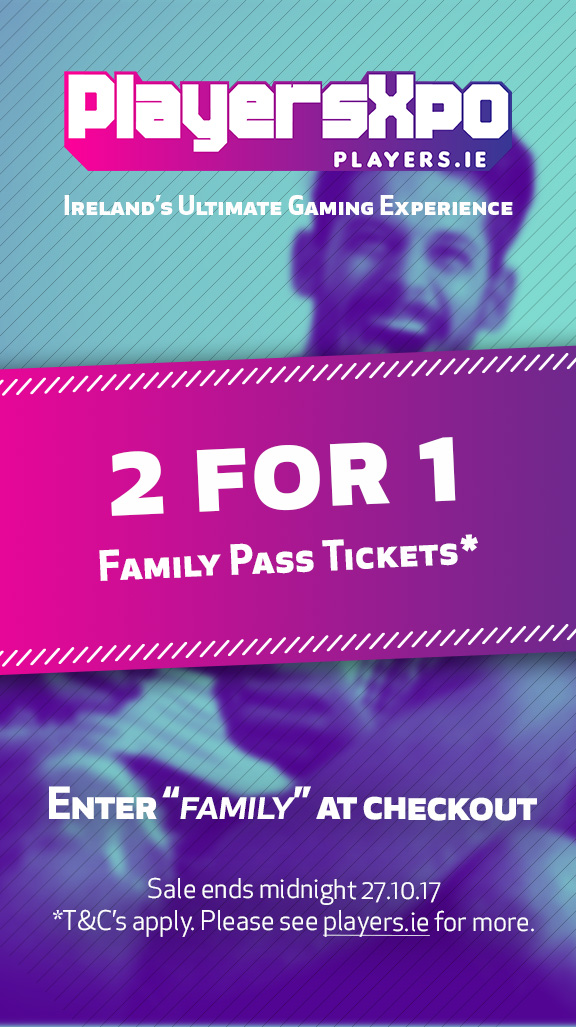
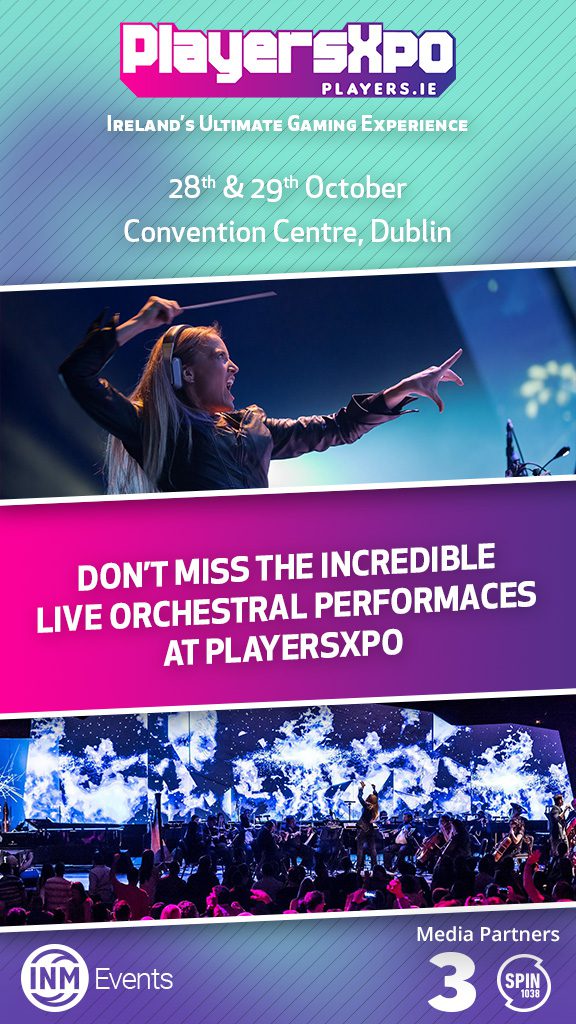
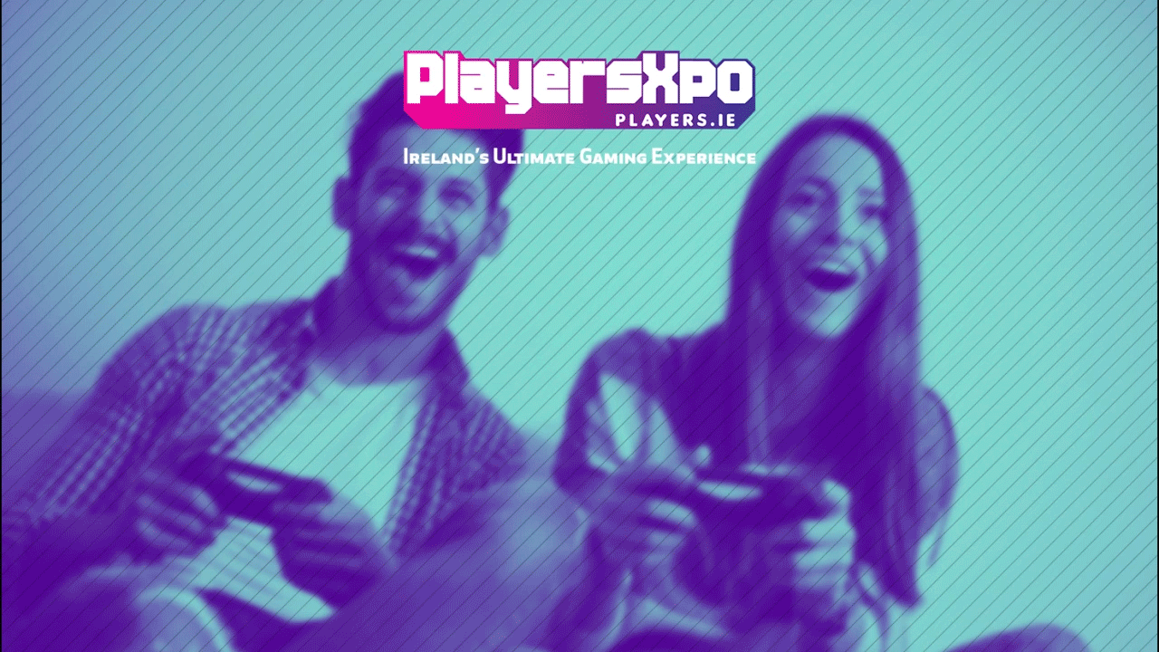
Along with the logo, I was asked to create an accompanying suite of assets to build a brand around the event including swatches and images. This included images that catered to the target audience – families with young kids, but also showed other demographics of importance in the industry – teens, and gamers in their late 20’s.
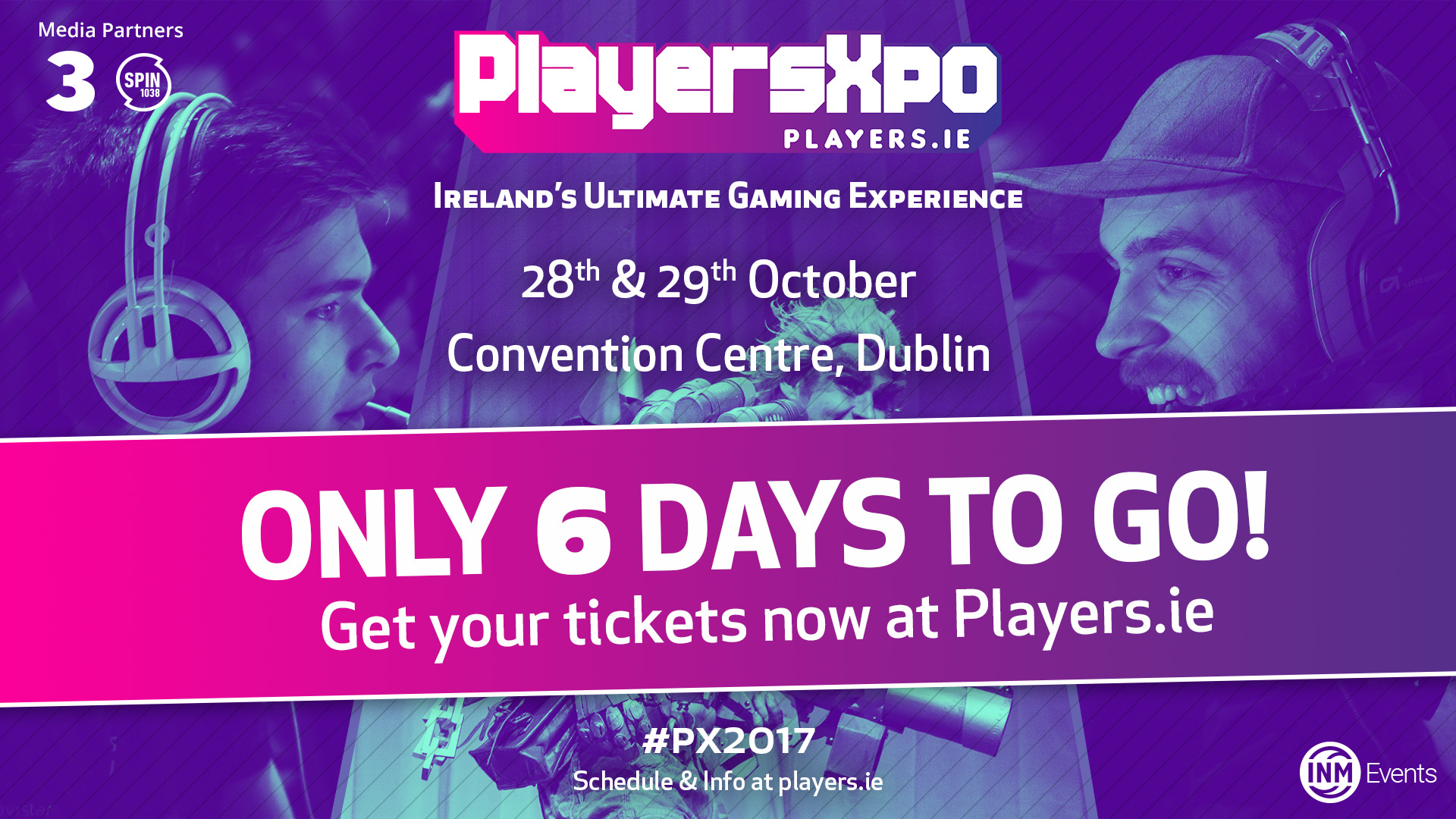
The treatment to the images was to process them with ‘Duotone’ colour. a two-tone effect that highlights and shades the lower and higher tones of the image. Darks get darker and the brights change colour. The effect allows you to draw attention to overlaying logos and text etc. This is a similar to how Spotify treat their images. The light blue/ cyan was chosen as a neutral colour that complimented the logo’s pink and dark blue. Along with the treatment there was also a stroke/line effect used to replicate refresh rates of 80’s and 90’s TVs. It sits at a 45° angle to compliment the grid system that the PlayersXpo logo is based on and further increased disparity between the logo and the underlying image in order to tell them apart easier to reach its maximum legibility and readability.
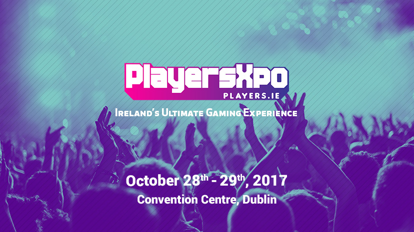
PlayersXpo Video
For the launch of the marketing a social media campaign in the build up to the event, I was asked to create a video teaser trailer. This was made in After Effects, using engaging language, interesting text motion, graphic elements and background videos to keep the user entertained through out. The goal was awareness with the secondary goal being sales of tickets and making the user aware that tickets were on sale at the point of the video’s release. The video stays within the branding guide of the existing logo and assets. It was a mammoth challenge, with a lot learned in the process;
* This is slightly different to the final version of the video, rather the full, unedited version.
Print & Digital Ads
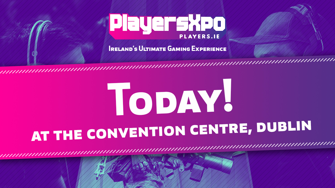
Along with the assets for the design, logos, branding, video etc. A number of ads were made in conjunction to promote the event across various different channels and outlets, via both print and digital. Both formats were to include all elements of the design including copy to entice people to take action (like any ad), the digital ad’s goal was to inspire viewers to buy tickets. The print ad’s goal was to spur potential brands to exhibit at the event, listing the events benefits from a selling standpoint and how much potential revenue could be made and who was organising the event in a bid to cash-in on the klout of the organising party.
An example of the digital and print ads;

Summary
PlayersXpo takes place in Dublin, Ireland on the 28th and 29th October. This was a passion project to work on, fusing many of my passions into one project that I was grateful for the opportunity to have. A project that covered design, video, motion, branding and lettering.
If you would like to work with me on a similar project, get in touch and let’s talk cool things – Hire Me!