What is Creators?
Creators is a website that is an aggregator of top written, visual or other content from creators around Ireland, making it easy for readers to find new creators to follow and engage with fresh inspiration and different perspectives.
It’s a community that encourages and supports one another with training and collaboration opportunities for the creators.
The Brief
After being explained as to what ‘Creators’ was, its target audience, who will be using it and for what. It’s a platform of ideas, personal insights, tutorials, ‘how-to’s, experiences and motivation for people to find a new perspective, inspiration, motivation, entertainment and learn from others. The brand’s (‘Creators’) values stood for creativity, community and collaboration and their personality encompassed a cheeky, curious, and smart nature.
Some of the attributes of the brand were that it loved new ideas, treasured great content as this was where it’s valued stood. They want to share new things, be deeply connected with its community. Is a constant learner – curious and eager. They want to be authoritative but not a know-it-all.
Understanding the personality of a brand shapes how they look.
The idea was to create something personable, something with flow, similar to a blogger with a good flow in writing, it had to resonate to the context of the platform – writing. After all, that’s what this was all about.
The brand was keen on simplicity, but not a sparse simplicity. Minimalism was important and wanted to connect their personality to the logo. The logo was where the defining factors of their personality would shine. Because each creator will bring their own unique style to the platform, the brand wanted to keep the overall branding to a minimum but with a powerful, defining logo and unique iconography. Letting other users contribute their own content has the potential for clashing art-style and for the platform itself to become incoherent and feel disjointed. A commendable approach from the brand to understand this and not have their own brand distract from the very creators they promote.
The brand’s lookbook maintained an organic feel – Typewriters, wood, pencils, sketches and writing equipment, workspaces, potted plants, and a hint of nature. Colours included violets, stone grey, soft pinks, sky blues.
The Process
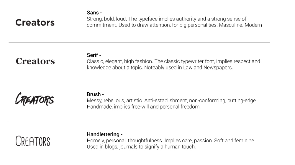
Exploring the idea of serif and script, I started with sketching out letters that joined naturally through script writing. I knew the direction I wanted to go in to convey the spirit and personality of the brand, which is made easier with a detailed yet easy to understand brief.
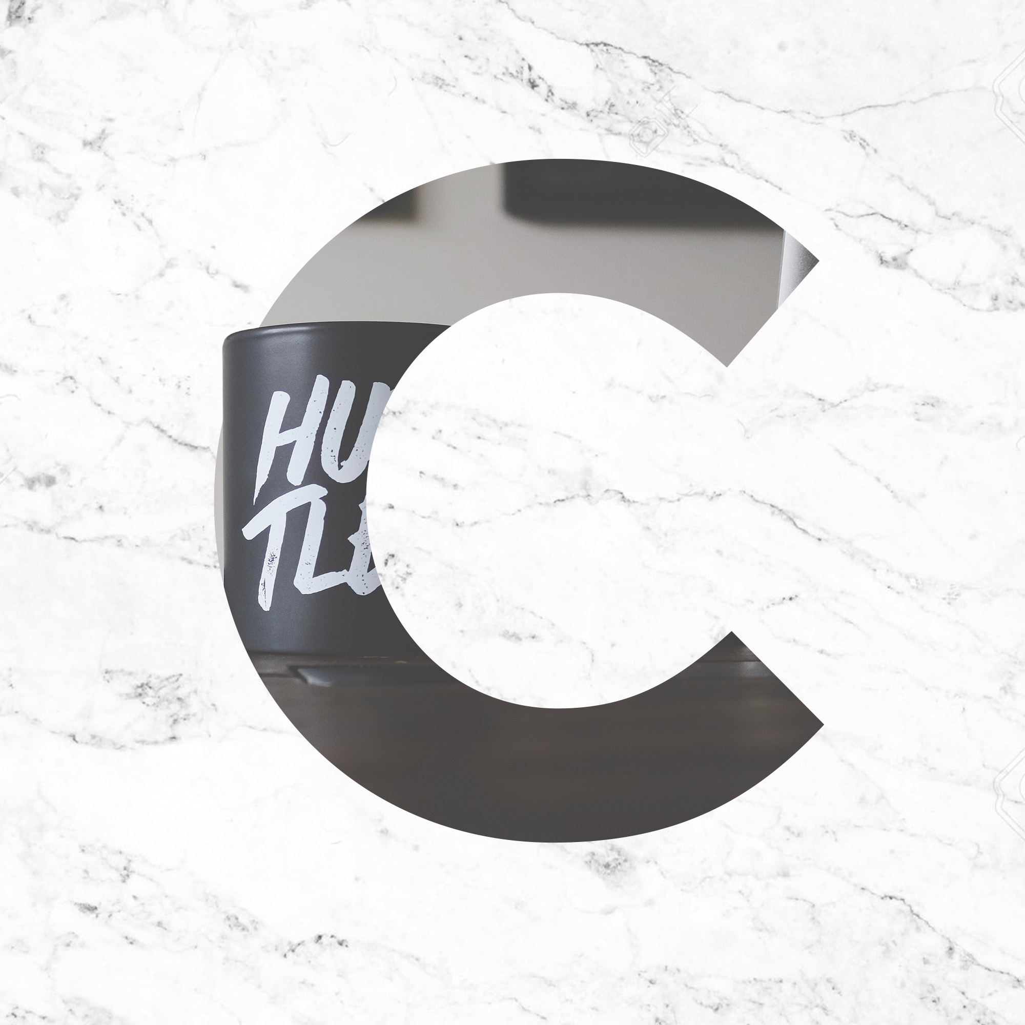
The brief specified a distinctive ‘c’, something that would be unique but stood well next to the rest of the letters. The idea was that the ‘c’ would be used as a logo mark, an icon that could easily be identified as part of the branding. As a new company, the ‘c’ logo mark should be able to help people easily identify the ‘c’ and its association with the company to help as part of its initial launch and marketing.
Early on in the creation process, the client wanted to explore the logo as a sans typeface with softened edges, which would take the harshness out of the logo and give a more homely appeal, yet still, maintain authority. (These explorations can be seen further below). There was also a request to see what the logo looked like if it was surrounded by shapes and with letters different sizes.
After exploring and showing these to the client, a decision was made to create a custom lettering logo as this was the best way to express the personality of the brand and maintain a uniqueness exclusive to a custom piece. Something that no other brand or logo would have, and belonged solely to them. With this, I began sketching initial logotypes for Creators.
Below are some examples of initial ‘creators’ sketches:
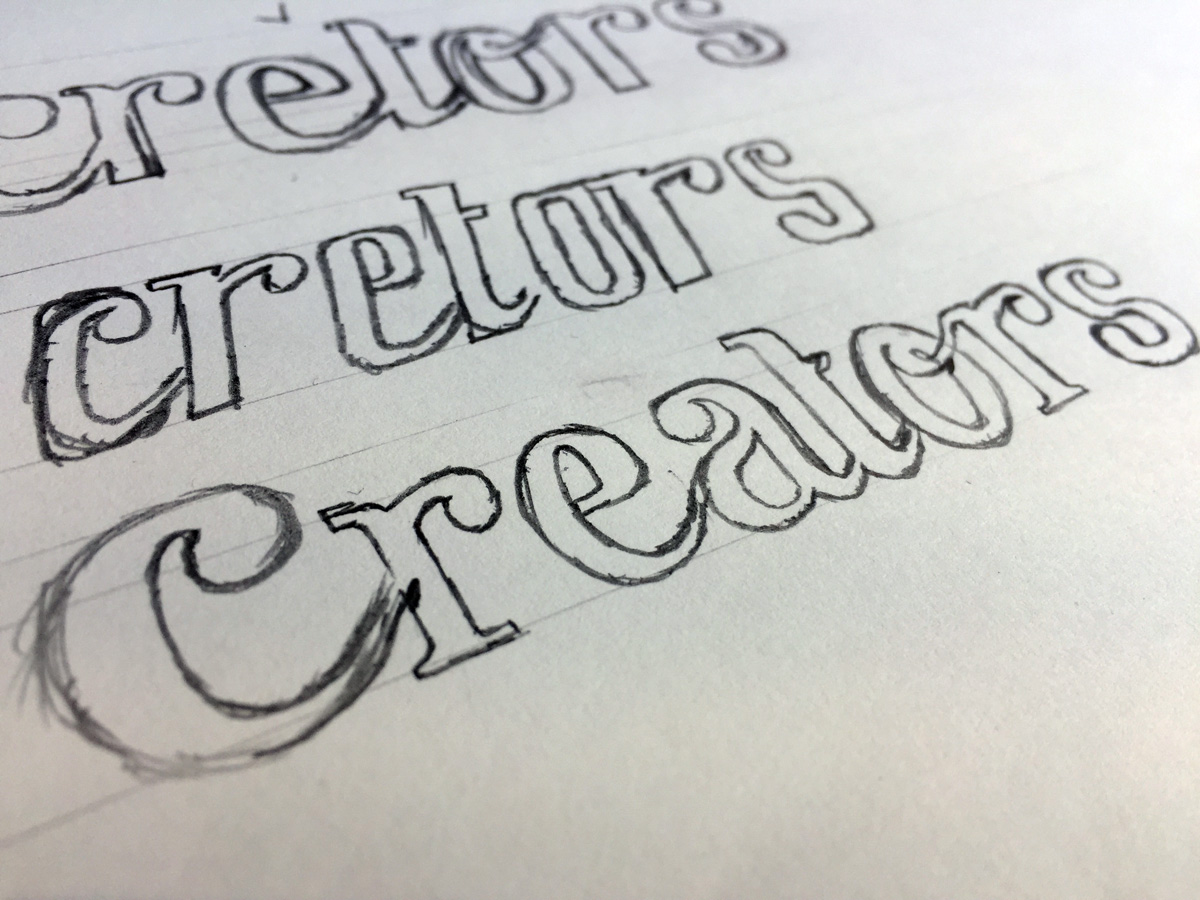
Started by realising a style based on the brief, then sketching out variable versions of that style. Some wordmarks had connecting letters, some further spaced apart, and then the letters themselves – altering the smallest details such as the positioning of the ‘ear’ of the ‘r’ or adding a ‘bowl’ or ‘stem’ to the ‘e’ etc. It all comes down to experimenting with shapes and styles to complete each letter.
Custom lettering is about adding personality and flair to make a word flourish.
After various iterations of the ‘creators’ logotype and finding the one version of the handlettered logo to use as a base. I then scan that version into Illustrator. From here, you can use the pen tool to trace and outline the entire word, letter for letter, using anchor points to adjust the shape of the letter perfectly. Or you can change it if the handlettered version was simply a guideline, which is what you may do it you have a lot of versions that you want to scan in and experiment with on the fly.
But generally speaking, I usually stick to one solid sketch, created with minimal error so that it’s easy to transfer and recreate digitally. Experimenting is for paper, refining is for computers.
When the letters of the sketch have been recreated in Illustrator, now you start refining the word based on typography principles and practices. From spacing – leading, tracking, and kerning. To style – serif, sans, slab, script etc. and then the artistry that ties each letter together to make it feel familiar to each other so that no one letter feels like it’s out of place in an overall word.
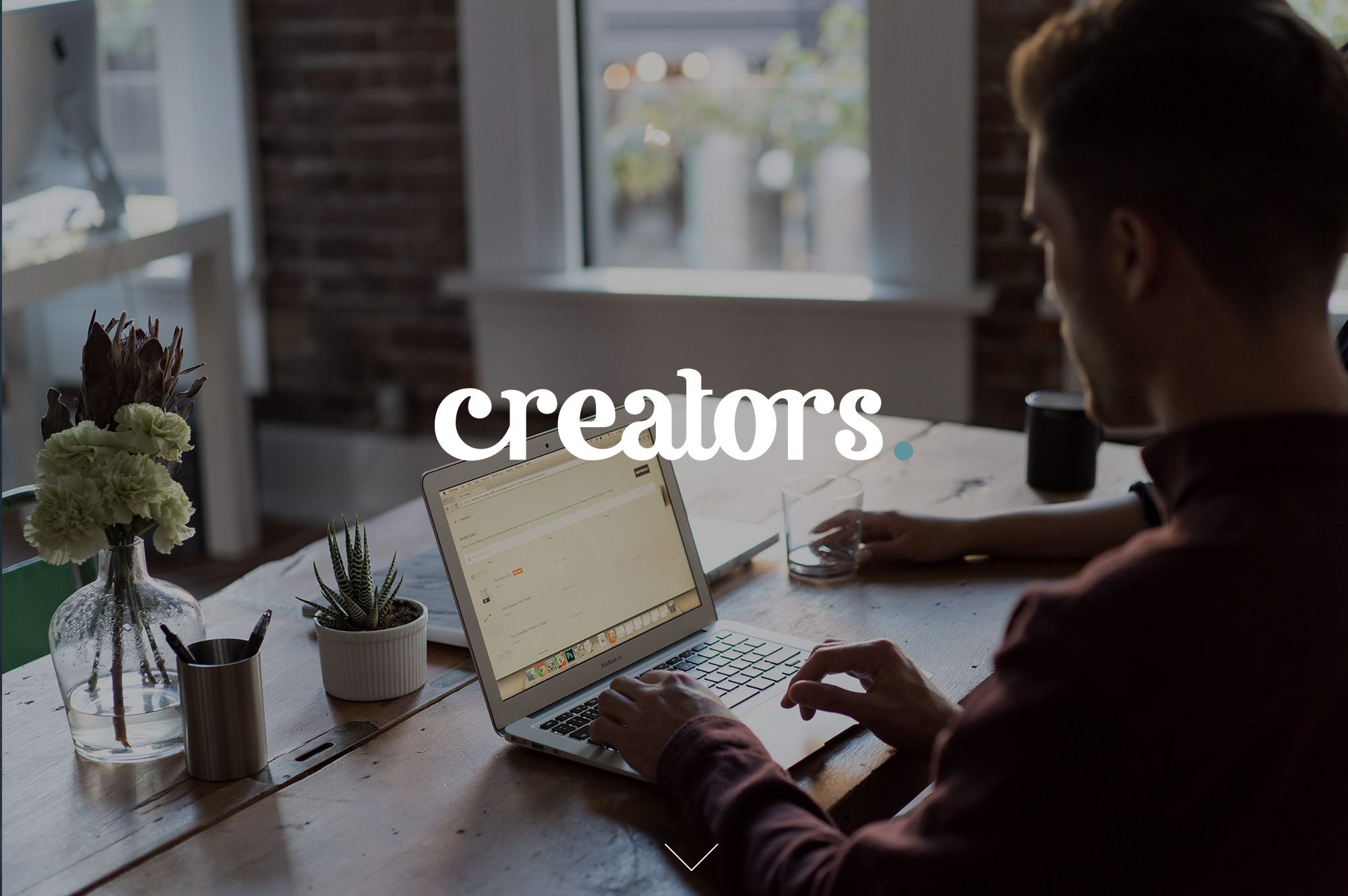
From this, the final logo was designed:
![]()
Branding
Creating and building out a brand was another task alongside the logo. Expanding upon the personality mentioned in the brief, the brand wanted to be strong and authoritative while maintaining a minimal and semi-traditional homemade (‘blog’) style. This included a lot of natural and organic images. Images of secluded and peaceful work areas, outdoorsy images features flowing water etc. to convey movement and subtle energy. From the handmade approach, we explored imagery relating to writing utensils, paper, paint, porcelain and marble textures, old wooden and boutique, vintage-style tables.
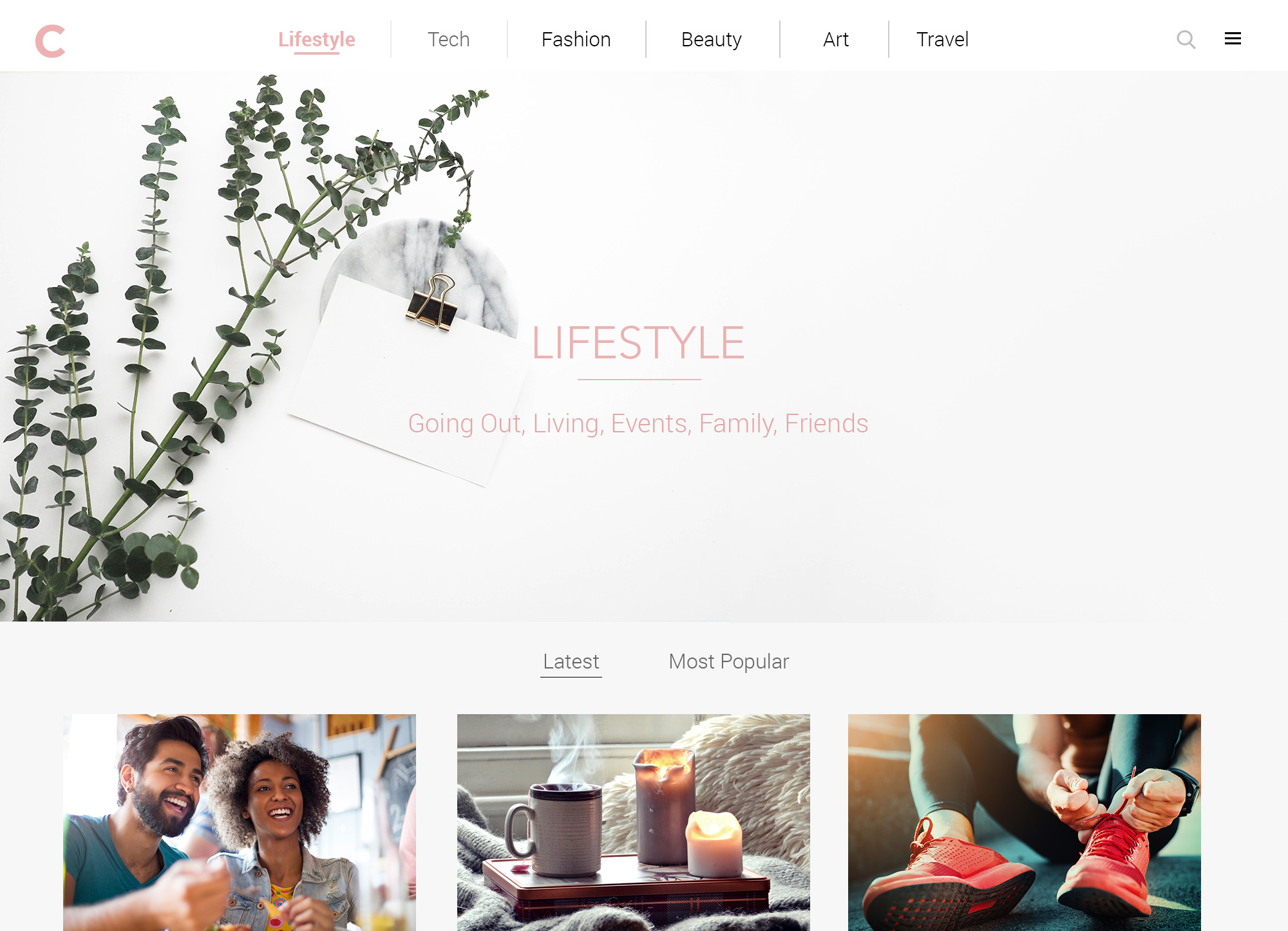
The website hosting the brand would have links displaying the various topics that the creators would write about, with each section owning a colour, Tech – grey, Lifestyle – pink etc. The home page of these sections would host a ‘hero image’ depicting apt imagery relating to the topic, with the article and blogs underneath laid out in a clear, square grid pattern.
The colours of the brand would feature a ‘washed’, whitened palette, similar to pastels, but a slightly darker tone. This was the colours of the brand wouldn’t stand out or clash with the colours used by the writers with their own particular style and colours. The goal is to be as less intrusive as possible to avoid a smorgasbord of bright, dark, vivid and contrasting colour across the platform.
Below are some early examples of branding, icon, and colour exploration;

Summary
The project was the best that any designer/artist etc. could ask for, the client was open and willing to explore different routes to conventional typography and branding. There were some other explorations that didn’t quite make the cut, such as; a full stop at the end of the lowercase logotype. Using the colour of the full stop to depict where you are on the website etc. There are some practical uses but ultimately it was never used.
The custom logotype gives the brand a unique logo, different from a font, where anyone can buy and use. This way, the brand has something exclusive to them.
There is a lot to be said when a client is open to new ideas and exploring alternatives beyond the beaten path.
See the platform in action here – creators.ie (coming soon)