‘Secret King’ is a personal photography project.
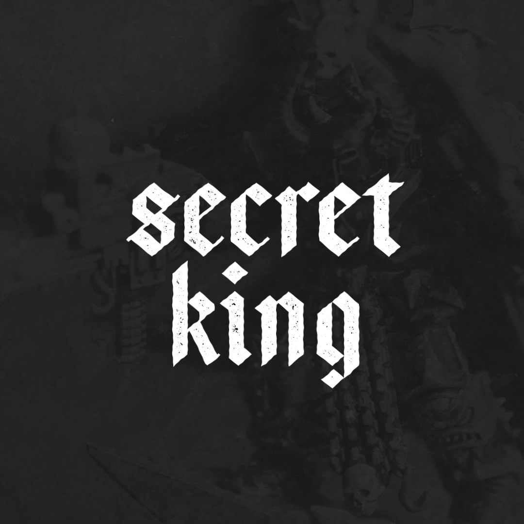
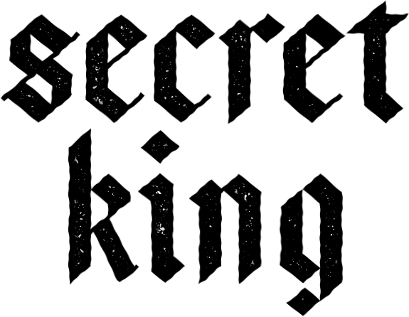
The logo was inspired by grungy gothic-style typography. I wanted the logo to be ‘dirty’ and textured to convey the emotion of each image. The subject being miniatures in macro photography style, close up, in dramatic scenes.
To tell a story. To transport that viewer/reader to that world, into that scene.
How it’s Made
Miniatures are painted (by hand, by myself), again, to train my skills in painting, but mainly because painting for me is an incredibly meditative process, particularly miniatures. Learning and practising different skills in painting, from layers, blending, dry brushing, stippling, and highlighting, among glues, modelling, basing materials etc. there is a lot to learn and a lot to get good at in regards to miniatures.
Before the miniatures are painted, I will come up with a concept on which to base the miniature, in terms of story, world, and what emotion I want to capture and create. Where are they based, why are they there, what happened or is happening to them there? The idea of taking the shot and photographing them is one thing, but to tell a story and grip the reader into believing that this is a real universe and real scenario in a fantasy land is another.
When the miniature is decorated, work begins on the surroundings/backgrounds. I like to shoot images in a real setting, ie. not green screen and photoshop them in. The background is stock and sent to a printer, mainly in A4 as the background is mainly blurred most of the time and at such a close proximity, which doesn’t feature predominantly, it’s an A4 size. The scenes are created using miniature props, trees, bushes, and painted snow/gravel textures. The scene sets up the story, so it’s equally as important as the model.
Design
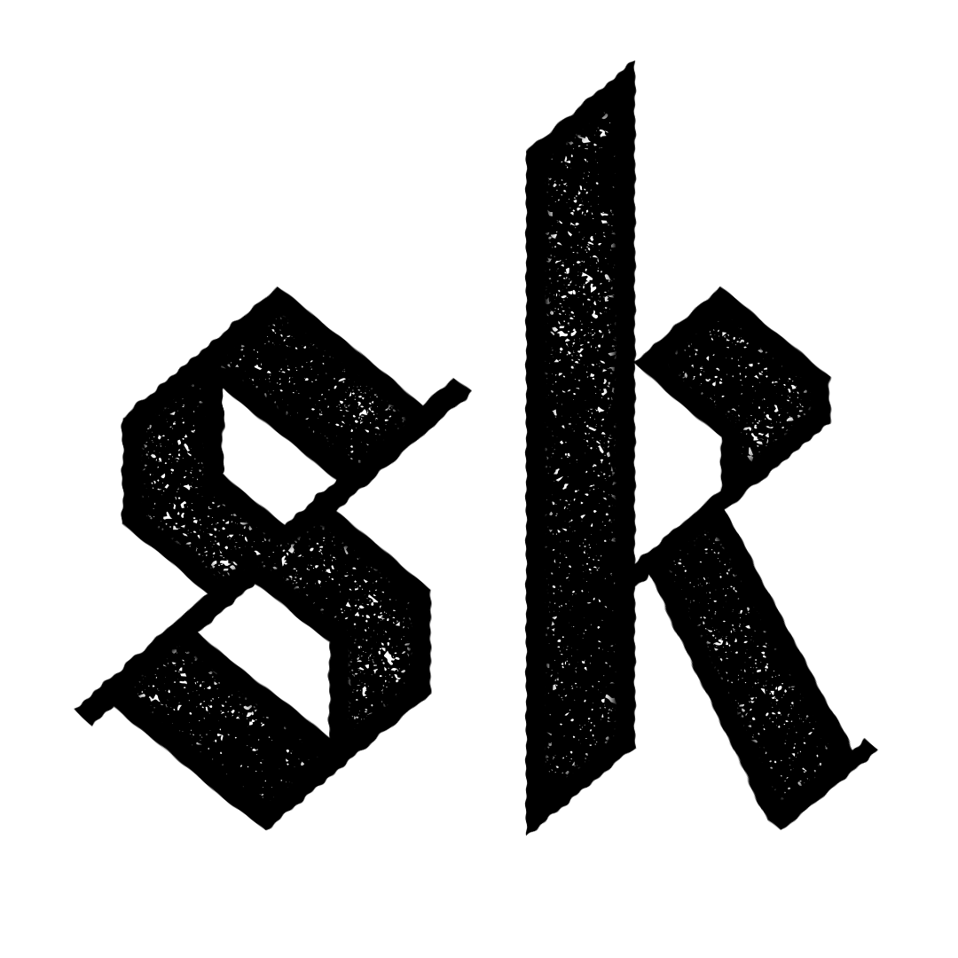
I wanted to create a brand with a blackletter logo; strong, traditional, authoritative, in control. The worn texturing on the insides of the lettering suggest it’s longevity, it’s weathered, it’s been around, doing its thing for a while. It’s a veteran. The same can be said about its edging, curved, morphed, it’s imperfect, it’s raw. The all-lower-case spelling in the logo, suggesting equality, nothing takes precedence. It’s unorthodox, and it’s mysterious thus. It’s inspired by Germanic, religious logos from a time passed. The symmetry, the movement, the diagonal slanting. It’s sharp. It’s blunt.
The brand colour; black, white. Life, death. Peace, conflict. Heaven, Hell. The design elements are inspired by unity and destruction, like the subject of the photos.
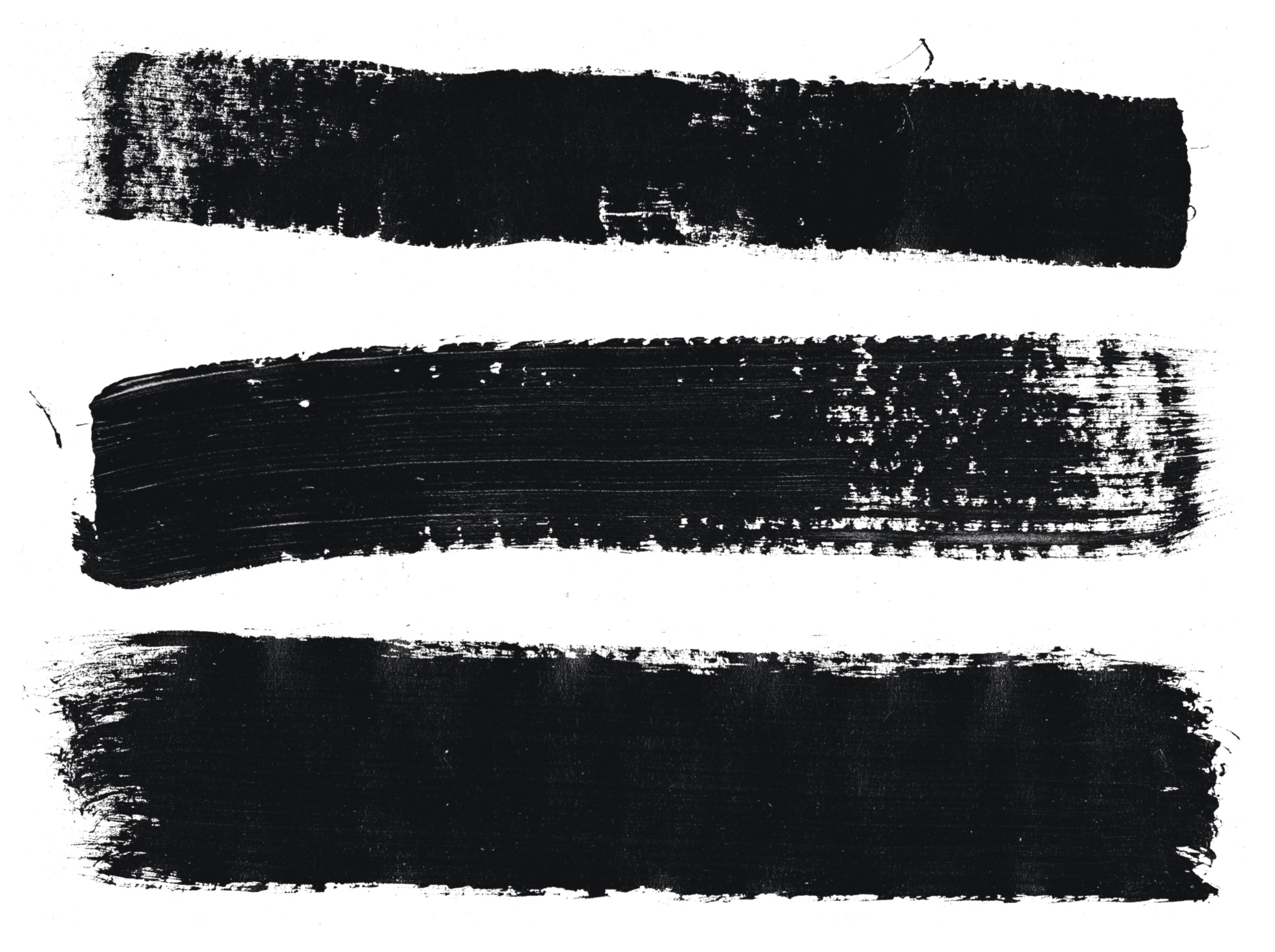
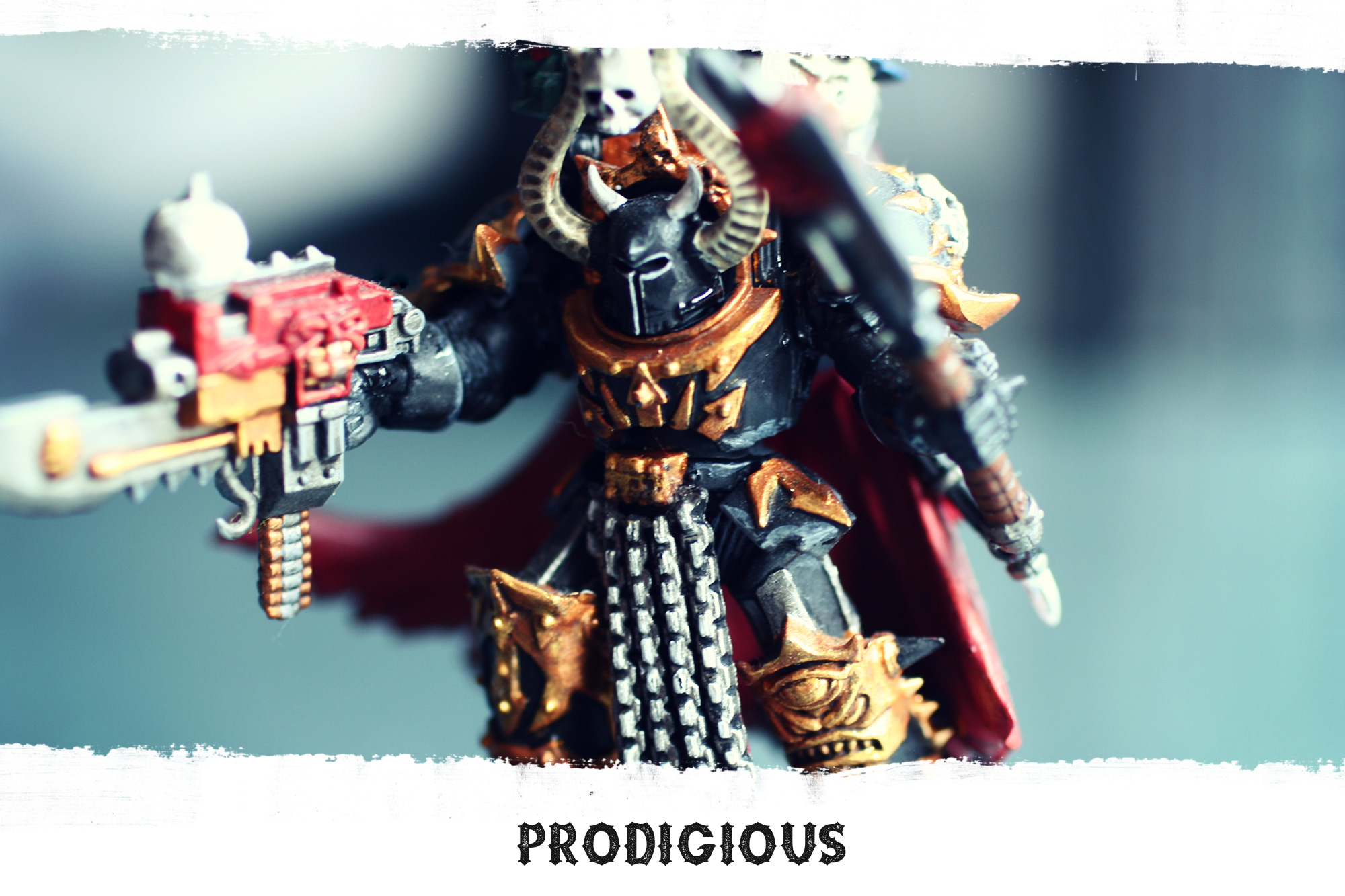
The framing of the photos involves texturing them with tick paintbrush strokes. Adding to the gritty, rawness of the images while given the brand a unique identity. Each frame uses different brush strokes to give a different feel to each of the images. A series may have the same frame for consistency. The texture and shape of the edge add to the character of the images and the showcases the brand. There were numerous paint strokes made for the project, 60+ in total.
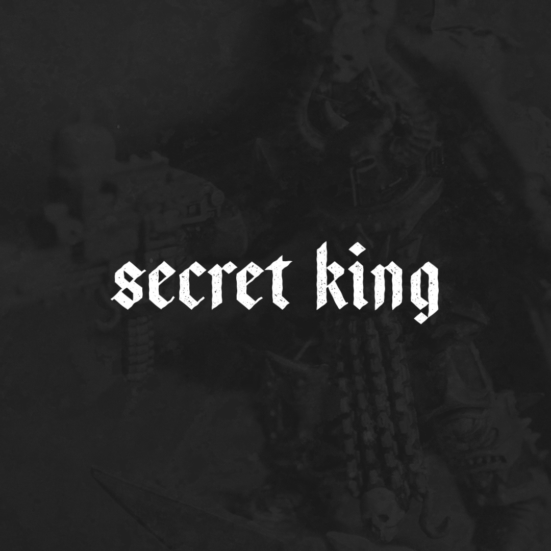
When posting text over an image, a coal/slag texture is used as an overlay. A dark, watery, and grimy texture used to remind viewers of that very nature. Usually, a white coloured text is placed on top of this.
Typography is as important when developing a brand as anything else, if not the most important, it’s what the users are reading for the first time when they see a brand. The shape of the letters, their own contours, curves, and texturing, tell the user what they are to expect from a brand without knowing anything else.
Type tells a story before you have to read.
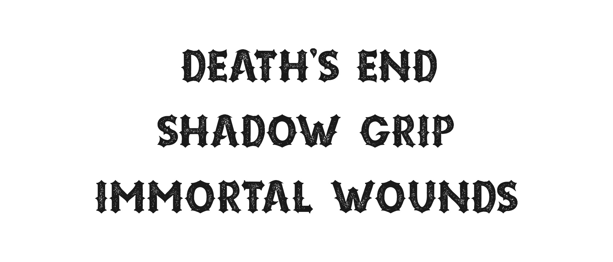
The font of the main logotype is ‘Bajern‘, a simple, minimalistic blackletter font with beautiful symmetry and sharp diagonal edging. The secondary font used for headings and displays on images etc. is the font ‘Riotic‘. A stunning weathered font, with texturing on the side. It’s imperfect nature and shape, reminiscent of old-timey snake-oil salesman typefaces of the wild west, sharp and rugged.
(See example image below for how the individual elements come together to create a piece.
Why?
This hobby combines some of my favourite hobbies, designing brands, photography and painting. As I get better at painting, I’ll also get more creative with the set design. From introducing spotlighting, LEDs etc., decorations, dry-ice and smoke effects, but all in a natural environment and not digitally introduced. The goal of the project is to train my product photography skills and post-production image editing skills, which will have a knock on to other areas and skills – learning Lightroom, understanding studio/macro lighting, production processes for getting prints made for different shots.
There are so many areas to explore. I’m learning as I go. I’m not an expert… Yet.

If you would like to see more examples of my lettering branding, check out some projects I’ve done here – Design
