
Savage Studio.
Logo for an internal design studio project in INM.
I was asked to create and pitch a studio concept for our team within Independent News & Media. The aim was to allow our team to brand itself and better market and sell our services. We had full creative freedom to do as we pleased in terms of ‘look and feel’, it was something that we owned, a way of showing us off, thus we could portray ourselves as we please.
We initially conceived names akin to newspaper and journalistic jargon from decades passed. Words like ‘Baseline’, ‘Extra Extra’, and ‘Hawker’. After considering these, we decided we wanted to incorporate Irish slang into the branding somehow. We started spitballing ideas and words that are relatable to Irish people when they heard it. It had to be quick, symbolised strength with a little bit of edginess, being at the cusp and forefront of modern media and digital design. With this, we came up with ‘Savage’.
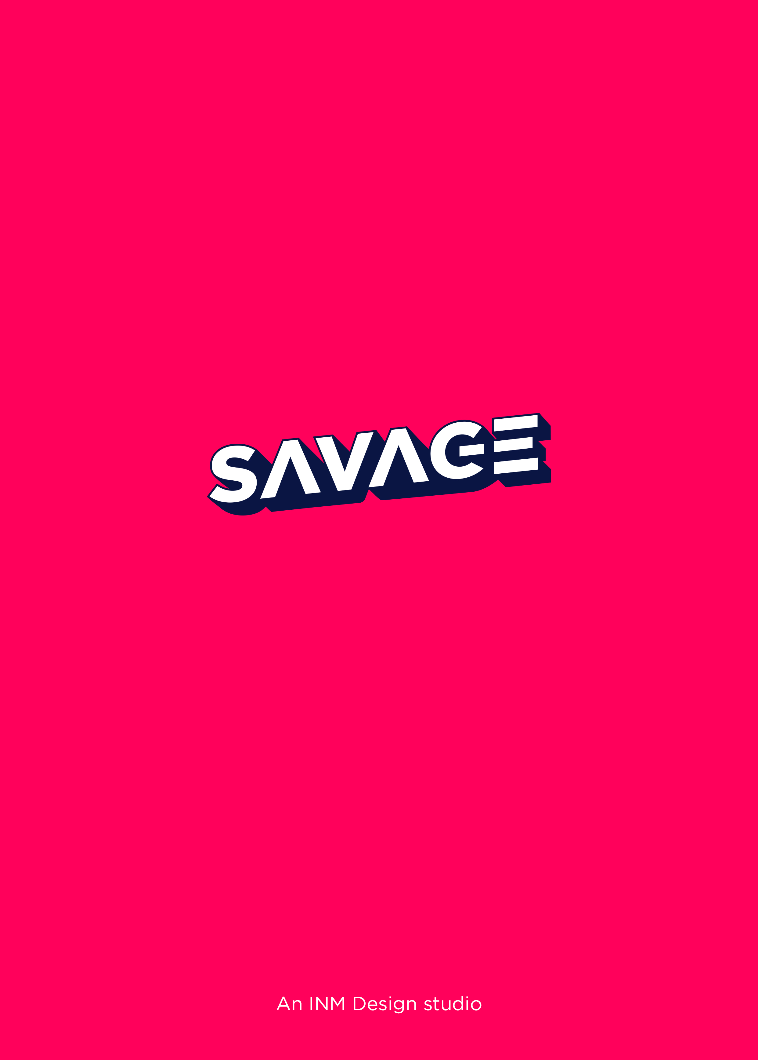
The design went through few iterations. I knew I wanted to try something with a bold, isometirc sans typeface. Something with minimal elements (no icon). This started off as a sketch, including the 3D shadow aspect. Then from sketching, I realised that the wordmark works on a shear angle without the shadow. If it wasnted for the want of putting a shadow behind the wordmark, I probably wound;t have had this word at a shear angle. But it works, which is testament to trying something new and just playing around with the word in various different formats.
Try to be experimental with a word. Put simple effects on them in Illustrator. Drop Shadow, Stroke, Inner Glow, you’ll never know what you can come up with or what may spark off an interesting direction from an initial word. Play around.
The wordmark’s elements itself, such as no crossbar on the ‘A’. This represents scrolling up and down, which is a noted icon/feature on many apps, websites and most forms of digital media. The bottom counter of the ‘G’ being cut out to represent an on/off switch. And the Stem of the ‘E’ being removed to represent text lines, an important part of a print and digital business such as INM.
The colours are iterative to the brand’s needs and were to be interchanged with each department that our internal design studio works under – whether that be motion graphics (blue), display advertising (green), or print advertising (red) etc.
The colours are modern and eye-catching. A palette I call ‘Sugar pop’. Intense pink with red undertones accentuates the urgency of the brand. Coupled with a dark navy shadow on white text.


You must be logged in to post a comment.