Lettering wedding invitations is big business. The handmade style of lettering offers a personal touch, something important for weddings. It’s all about these two people, their lives, their families, and their friends.
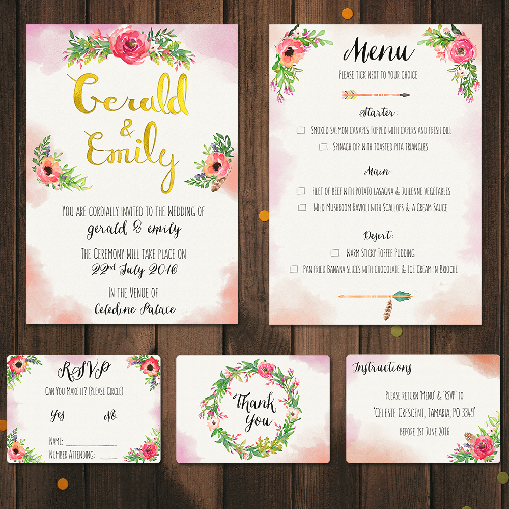
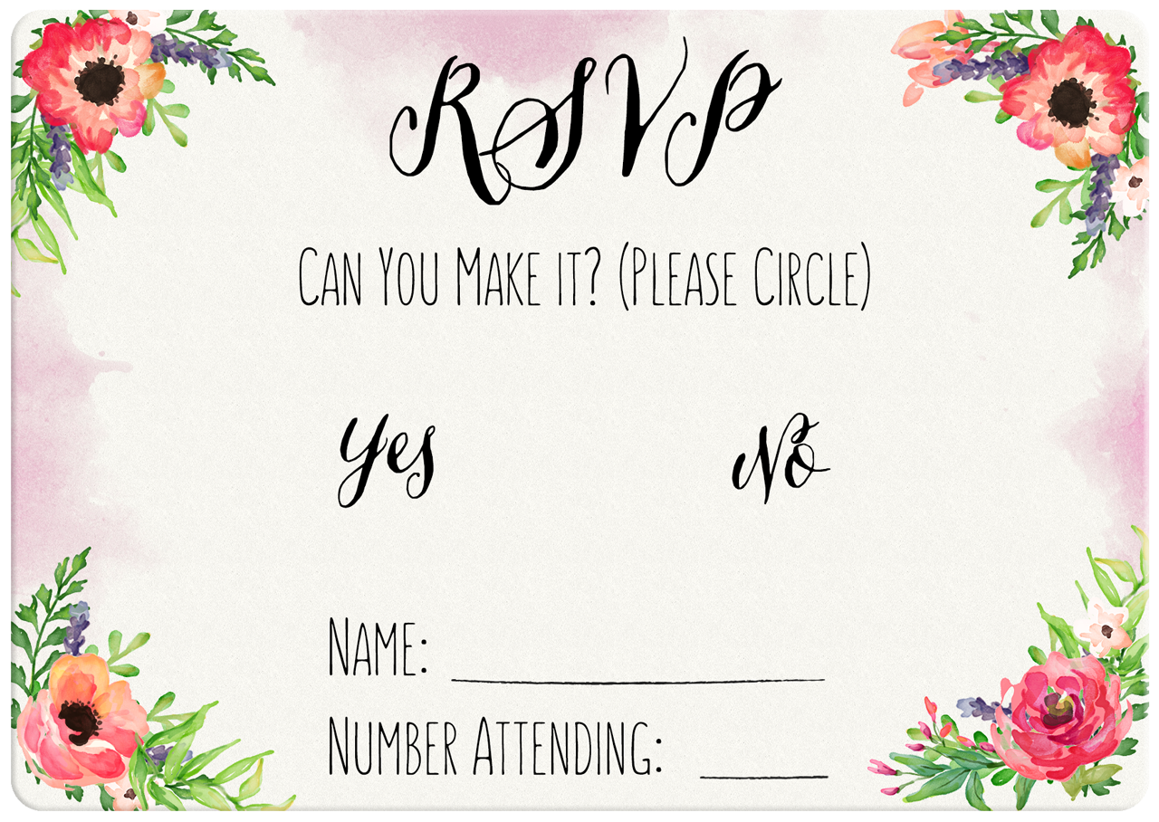
The goal was to create a suite of custom-made, lettered invitations which included the main invitation, an RSVP, a menu, an instructions card, and a ‘thank you’ card. The theme and date were the most important aspect of this project and all wedding projects. To know the ‘where’, ‘when’ and ‘theme’ of a wedding will set the tone and direction of the project and how the couple want the project to fit in with the rest of the theme of the wedding. Invitations aren’t arbitrary to the rest of the wedding.
Invitations are important to the couple because it will be the first thing that those invited will see for the wedding, thus setting the expectations to how the wedding will be themed and look like on the day of the wedding.
Below is the suite of invitations in their final form;
The Brief:
I was approached by the bride to create a full suite of invitations to be sent to friends and family members worldwide as a package. She knew she wanted a main invite, RSVP, Menu, instructions on where to send the correspondence back to, and a thank you card. She had a strong idea of what she wanted the suite to be styled like, and had come to me because of my lettering style. She liked flowers and watercolours and wanted this to be the prominent theme of the suite.
Lettering, flowers & watercolour. She came to the right person.
We both knew she wanted watercolour and some sort of floral design, this was to go with the rest of the theme of the wedding. I had one question for her at this point, “When was the wedding?”. This is a key question to ask in relation to weddings, especially when designing with flowers and watercolours. A winter wedding wound mean the flowers would be darker, using dark greens, purples, burgundy etc. and even different styles of plans and flowers. A summer wedding would mean bright flowers, yellows, reds, orange, whites, bright green stems etc. The timing of the wedding would change the entire style of the design. The wedding would take place at the end of July. A perfect time for a bright colours.
We knew the colours, and the design style, now we had to figure out the dimension, A4, A6, landscape, portrait etc. and how they were going to be printed, ie. on card stock, letterpress, silkscreened?
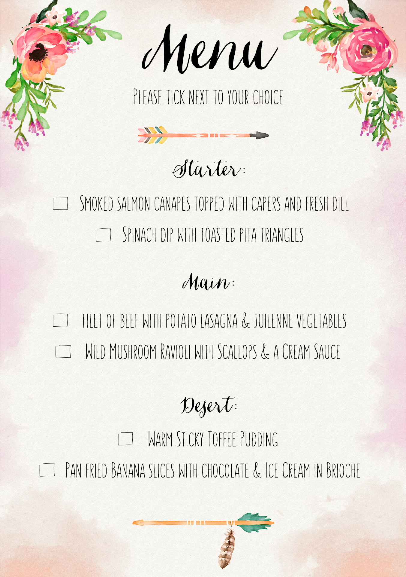
She decided which designs she wanted printed in which dimension and on what paper. Initially, she didn’t know what paper was what. This is the importance of forming a relationship with the client, offer you knowledge and help them understand each step of the process, what you will be doing, etc. I explained what each card stock and paper weights meant and what they would feel like, texture-wise. After explaining, she was happy to go with a heavy card stock on the smaller pieces which would include the ‘Thank You’, RSVP, and an Instructions card.
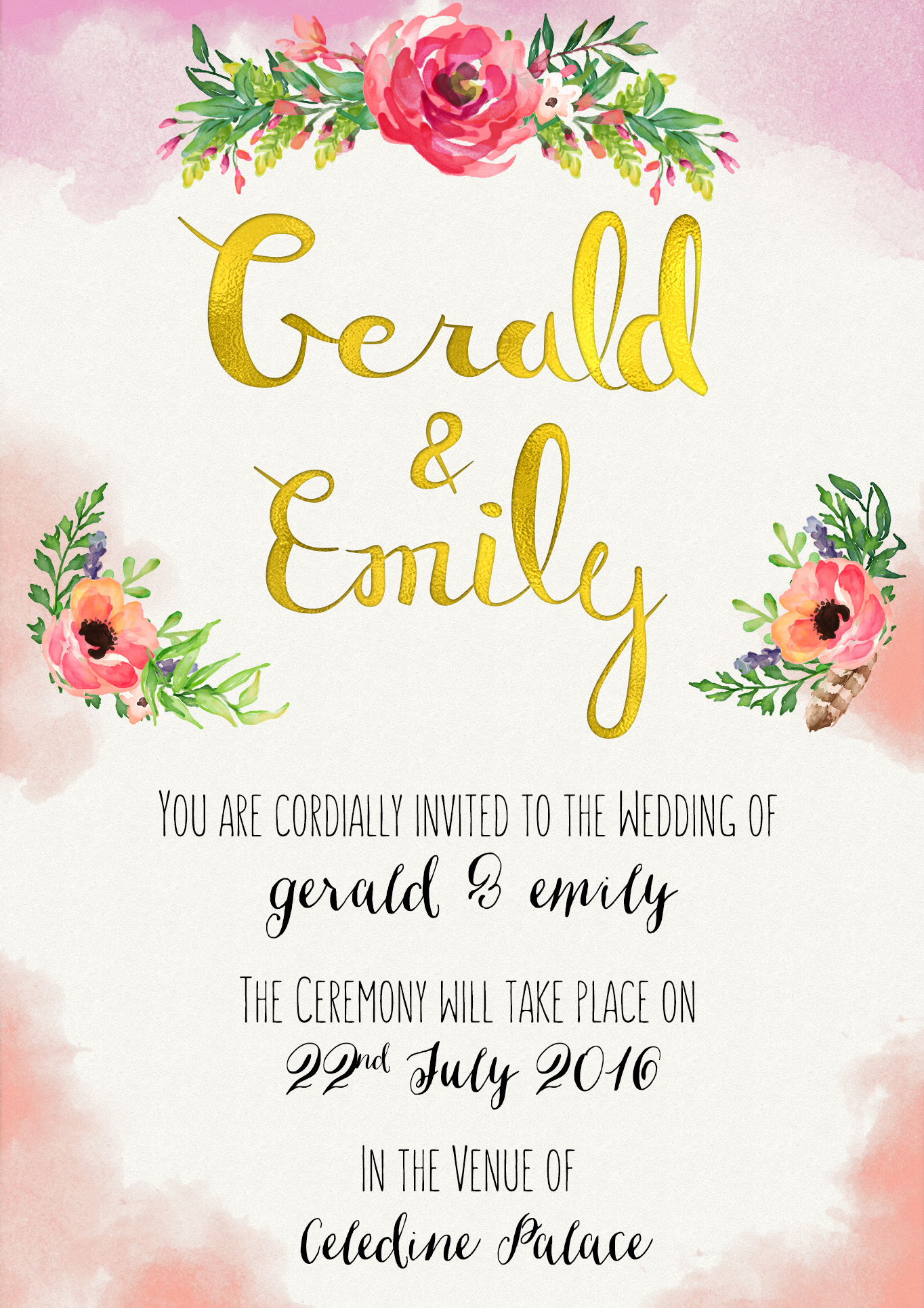
The client wished to make the main invite distinct from the others, I explained that she could implement a different colour or go with something completely different with a foil finish. I showed her some examples and decided to experiment with a gold foil finish on the main invite for their names.
Below are the final individual pieces of the suite;


The Solution:
The main element of the design was the couples names on the main invite. For this, I created custom-made brush lettering. This included a certain style I wanted to use, one that had to be unique enough to exist in its own right. Otherwise I could have used a font. There are thousands of dainty, delicate brush lettering fonts so I wanted mine to be similar in style, but distinct so that you could tell that repeated letters weren’t identical to the ones before it in the piece.
That’s how you know a something has been lettered by hand, when repeating letters are different from each other.
This was the first phase. I created the names from scratch, drawing the letters by hand numerous times to get the one that I like the most, and will fit in proportion and aesthetically when combined with another letter. It wouldn’t look right if different strokes had different weights, heights, styles, and mashed into one. This is where the a letterers skill and knowledge play into the design. How they can identify problems with letters (their style, weights, sizes etc.) and how to solve them to bring the final design together.
Each lettering artist has their own process when it comes to this part of the lettering process. Some create each individual letter then piece them together, others write out the word in full before bringing it into a vectoring program and digitising the artwork.
See below for an example of one of the practice sheets I used for the clients names on main invite. (The * means that I like how this one turned out and may use it in the final design)

The vectored image;
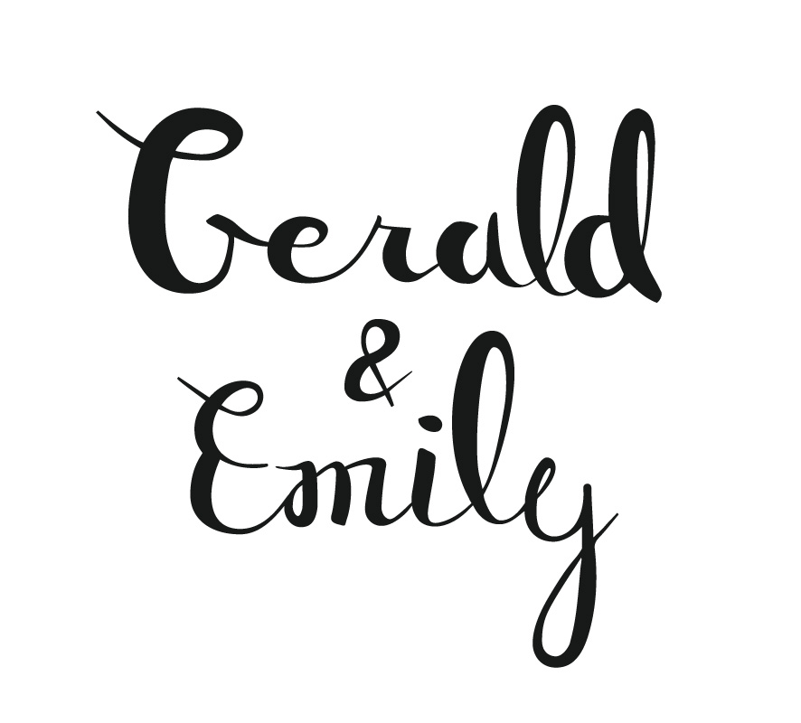 After bringing the scanned brush letters into Photoshop, inverting their brightness, and cutting them out and editing them in Illustrator using ‘Image Trace’, I piece each letter together using the typographical principles of ‘Kerning’, ‘Tracking’, and ‘Leading’ to complete the final lettered artwork.
The Design:
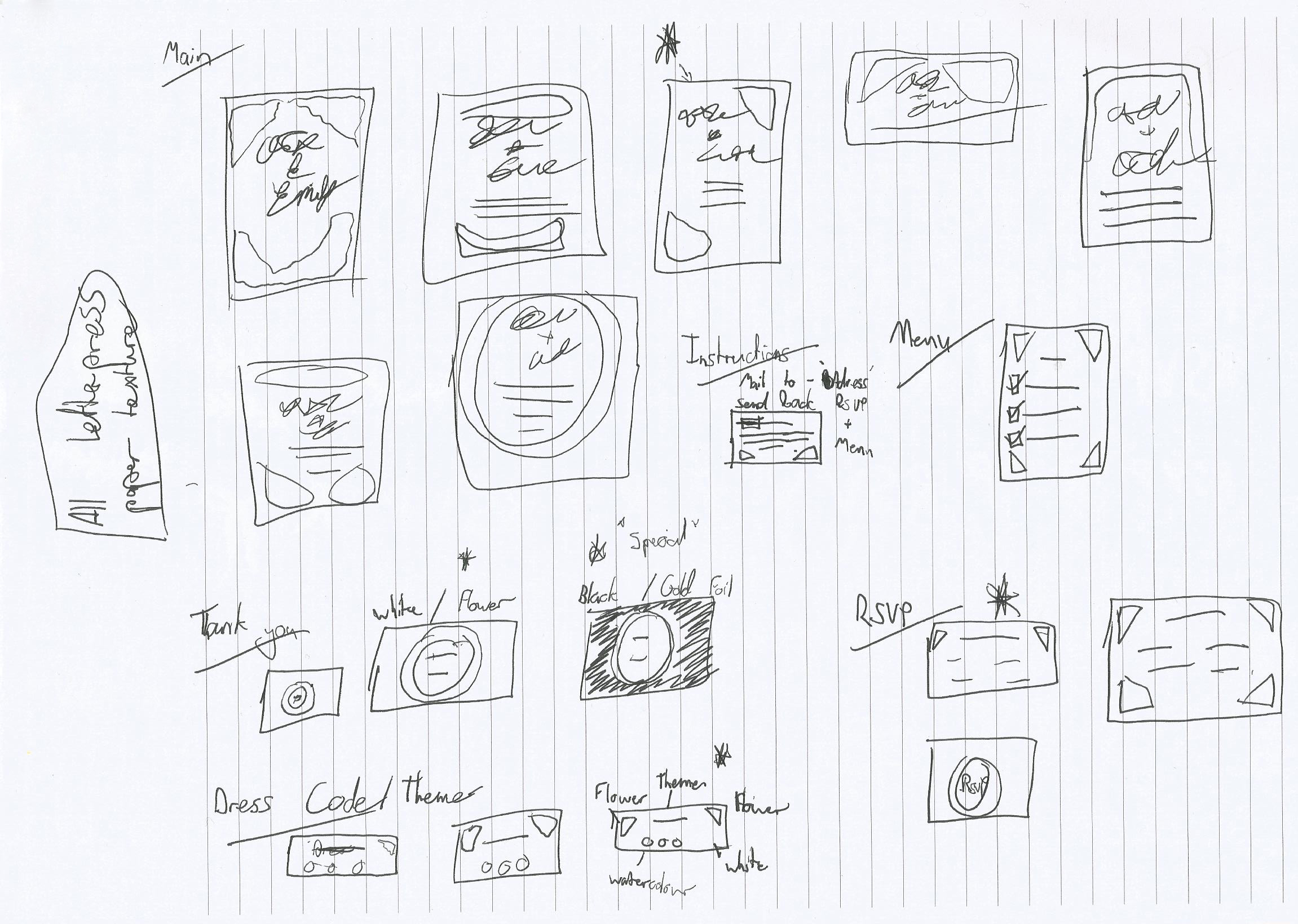
Now that I had the main element of the invites, I had to create the surrounding design. The client mentioned she wanted a floral and watercolour style. She had also mentioned that she wanted each part of the invitation package to be different. With this in mind, I sketched out what each page would look like. Bearing in mind, each had to be different to another for distinction.
After knowing how each page in the suite would look. I used a slightly yellowed letterpress paper texture for the background to emulate wha the card stock would be in the final printed version. I experimented with watercolour brushes for the edging around the paper. I stuck with the peach / pink still watercolour for the colour of the edging. The watercolour here was meant to compliment the main design, add separation to each element on the page, while serving as a decoration on the page. So it had both a technical and decorative use on the page.
For the floral watercolour design, I used a package of premade watercolured floral elements. Packs like these can be picked up on ‘Creative Market’ and other online design sites. In each pack you get leaves, flowers, bulbs, stems, and other floral elements to create bunches of flowers. I combined these elements to create custom-made bunches referring to the colours of the theme which the client wanted to stick to, which was red, white, green and orange.
I never add expenses to the client at the end of a project, this is what a quote is for, you are expected to understand what is needed and the potential ‘pay walls’ that you will come across that may end up coming out of your pocket. Included these prices your original quote to the client, then when they ask for changes, this is when it says in your agreement that ‘changes may incur addition fees‘. This can be for the time you spend after the project working on it, or for assets you may need to buy to correct the changes. Either way, changes can be bad because they eat up your time and they push completion dates and deadlines for the client back to. Small changes that can take less than an hour or even 20 mins are fine, but a full remodelling of the existing project is not good, and this is why you should reassess the project and charge for the time you are using to create what could be another project entirely.
See below for sketch;
For the typography, after creating the main element (the names of the couple), I used 2 fonts in the project. One was used to create a readable handwritten style to the design. The other was a handlettered font used as a decorative style to highlight important pieces of information, such as where the venue is, the names of the couple, and actionable elements to the project such as ‘Yes/No’ on the RSVP.
The fonts contrasted nicely, one being a slim handlettered style san-serif and the other a thicker brush lettering style font. They both add to the personality of the piece as a whole, and give it a handmade aesthetic.
After completing the design for the main invite, I consulted with the client, something I normally do not do in my process, but this was a bit more of a personal project, more so than a regular logo design or doing lettering for a business, not to say that either designs are more important than the other, but it was more personal, something the client held sentimental value to, for this reason, I was happy to be in constant communication with the client.
Conclusion:
There were no changes in the entire project, this was because I kept in constant communication with the client throughout the process, which is not something i do normally, and is a rare case. But this was a much more personal project which needed a lot of communicating throughout to comply to the theme of the wedding.
The project will be sent for print on card stock for the landscape A6 pages, and heavier stock for the A4 pages. It is impractical to send A4’s as card stock (also a lot more expensive to print, and if you are sending out 100+ packages worldwide, can run up costs for the client, who are already spending a lot on the wedding itself.
A successful project with no changes, a lot of client communication, and reasonably priced for the amount of work involved in such a project.
A lack of changes occur from 2 scenarios; a lot of communication, and when the client trusts the designer.
The final wedding invitation suite;