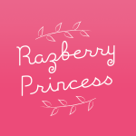
Razberry Princess is a branding campaign with the goal to design a logo that would be used across the brands packaging for jams and juices. The final logo would be rolled out on these products including different flavours of jams and juices. The logo would entail a few characteristics; maintain a homemade aesthetic, and feel organic and natural, as this would be the nature of the products that the logo resided on. Organic, homemade jams etc.
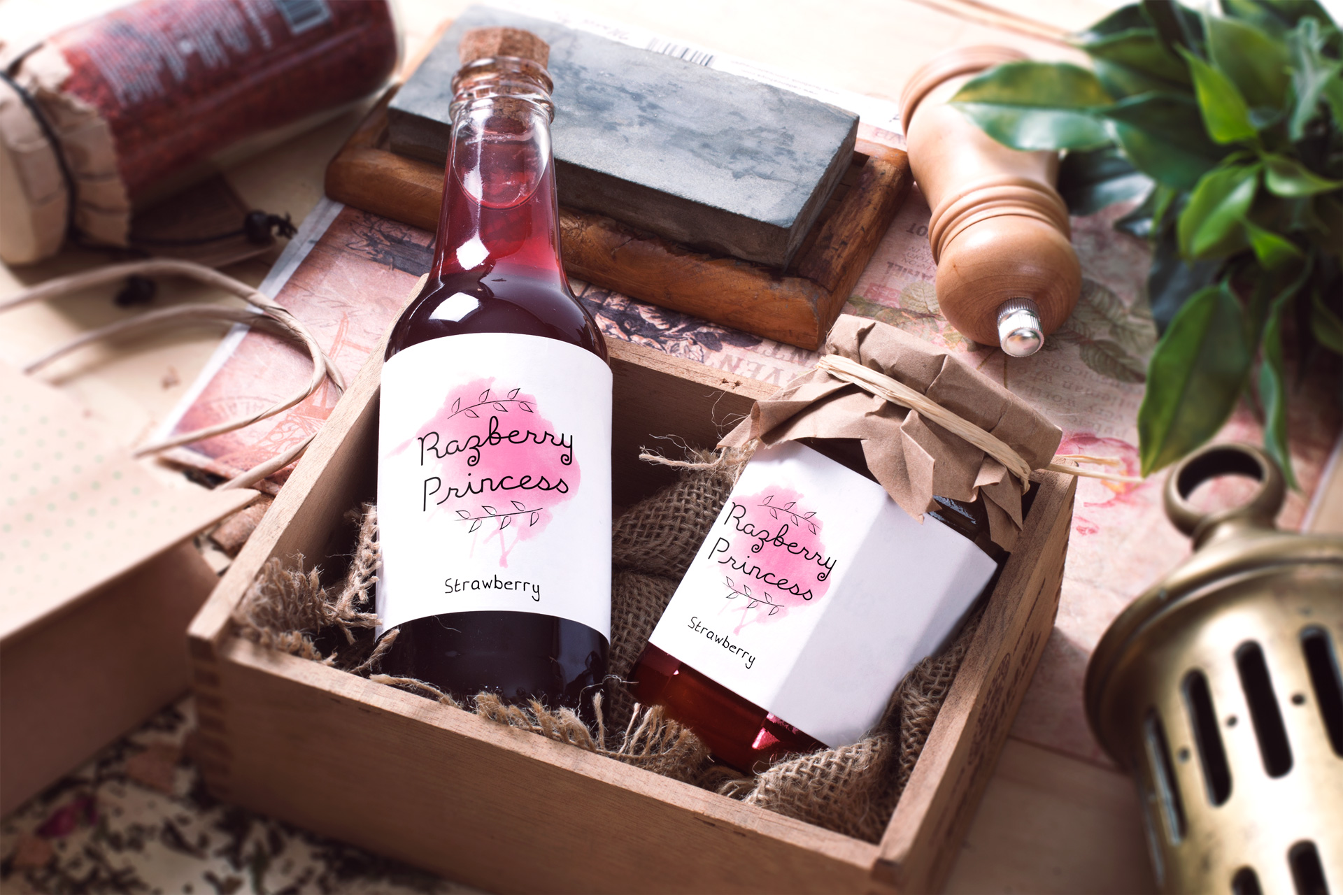
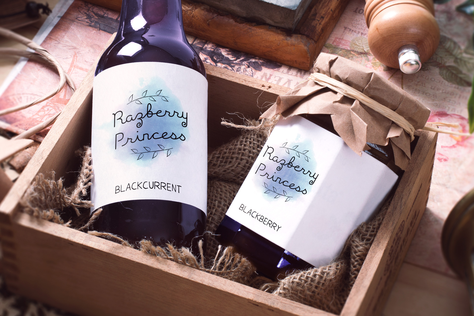
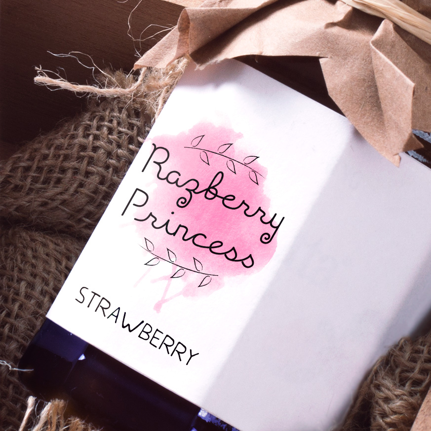
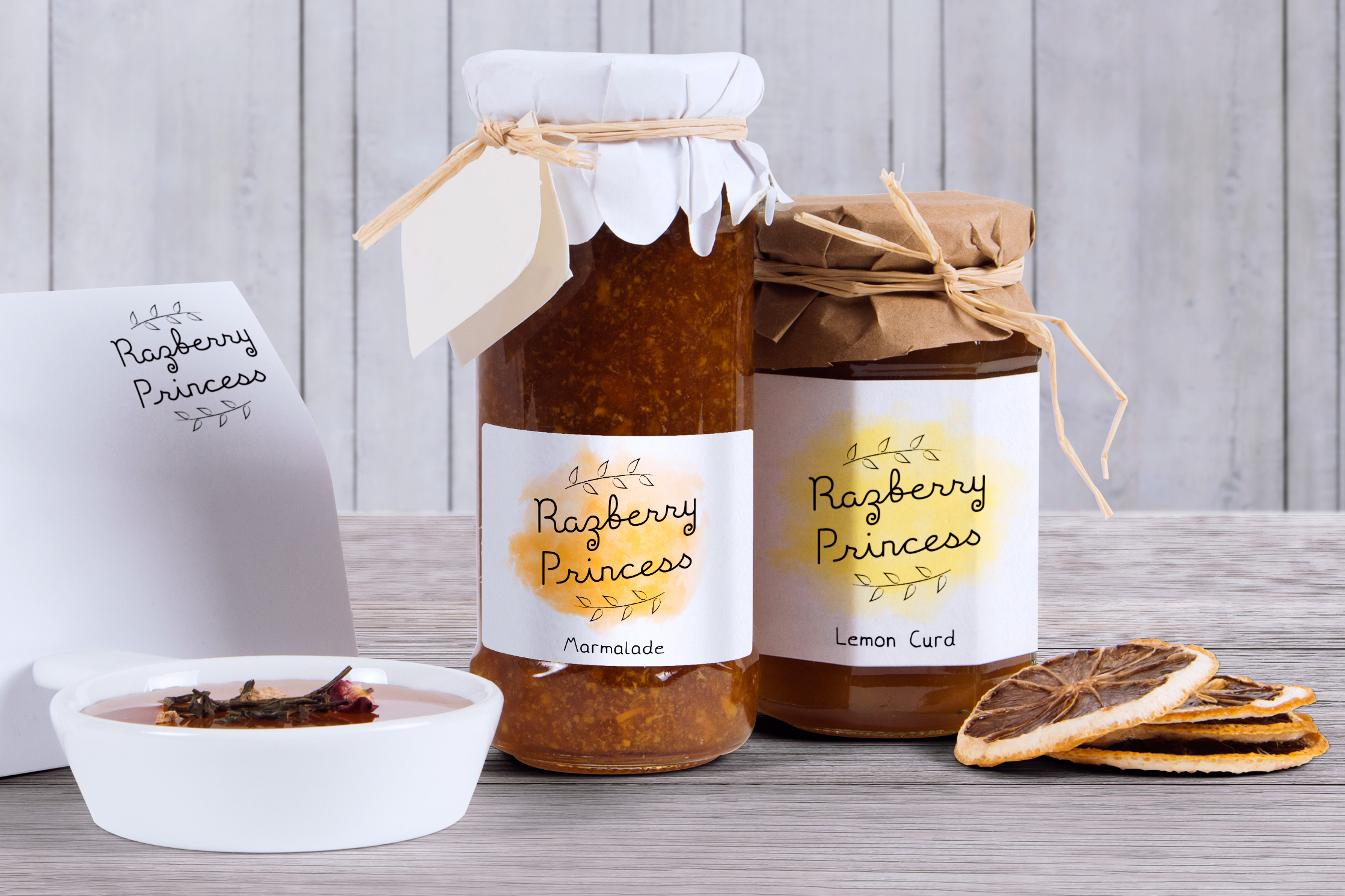
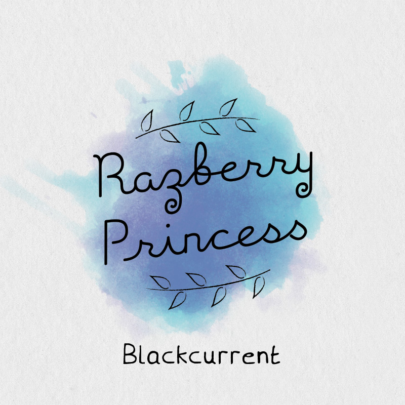
Below are shots of the logo on packaging, including; The lettered logotype, surrounded by brambles, with a watercolour ‘splash’ underneath, with a custom-made font on the bottom of the packaging to accompany and compliment the logo. The font would be used primarily as a way of identifying the different flavours of each product.
After the shots, I detail how I approached this project and solved the problems.
Case Study
The Brief
As mentioned from the brief above, the logo had to have a homemade touch, and feel like it was organic and natural. It would be sitting on organic and natural products, so contextually would feel correct.
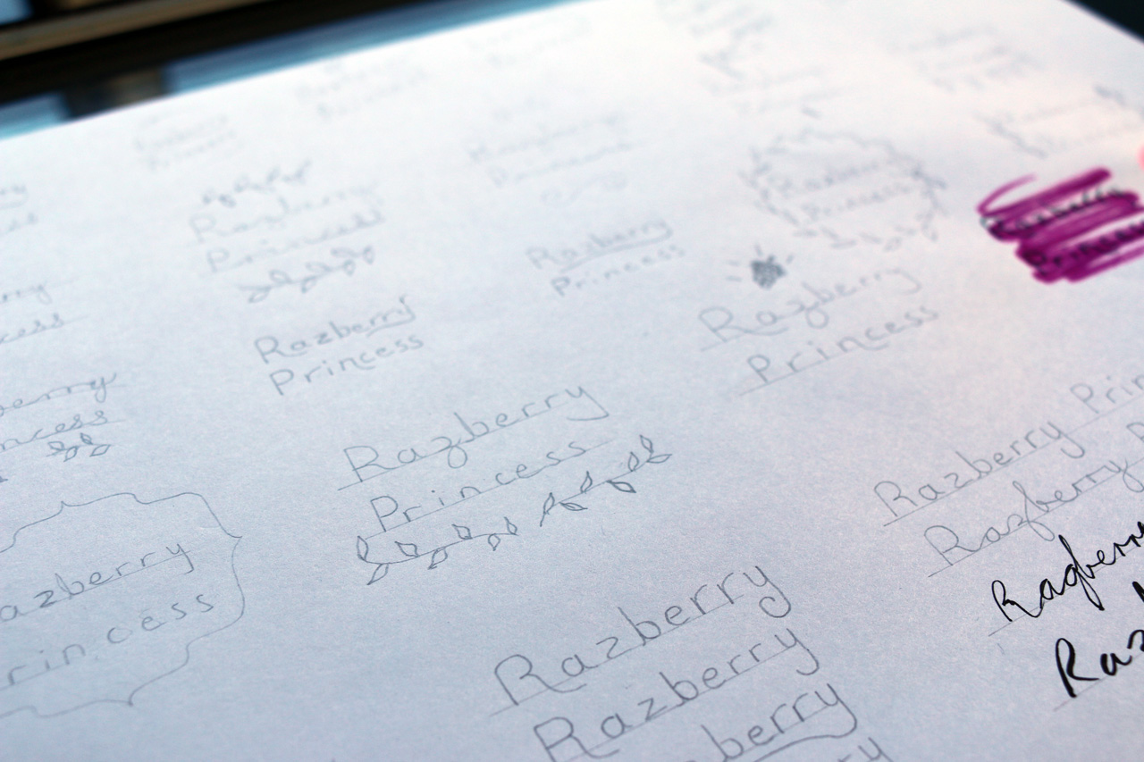
As always, it all starts with sketching, I began sketching several ideas and brainstorming which direction to go down. I knew from the beginning it had to be a stacked logo (one word on top of the other). So from that I began looking at ways to combine the text in a lettering format, including different styles of lettering, would it be scribbled, brushed, single stroke, or would it be joined like handlettering etc.? How would the text appear on the bottles/jars, would it be warped, skewed, straight, curved? And how would it look on different sized bottles? I experimented with the idea of all and also combined several ‘extra’ elements, such as brambles, fruit bunches and crowns.
The balance of which was offered by the extra elements added a lot to the design, especially how is sat on the paper, aesthetically, it added visual hierarchy and balance to the piece, instantly you looked inward to the heavier, more interesting text, then worked your way outside to the more faint, thinner elements. I knew I would include extra elements from this point on, so designed with these in mind.
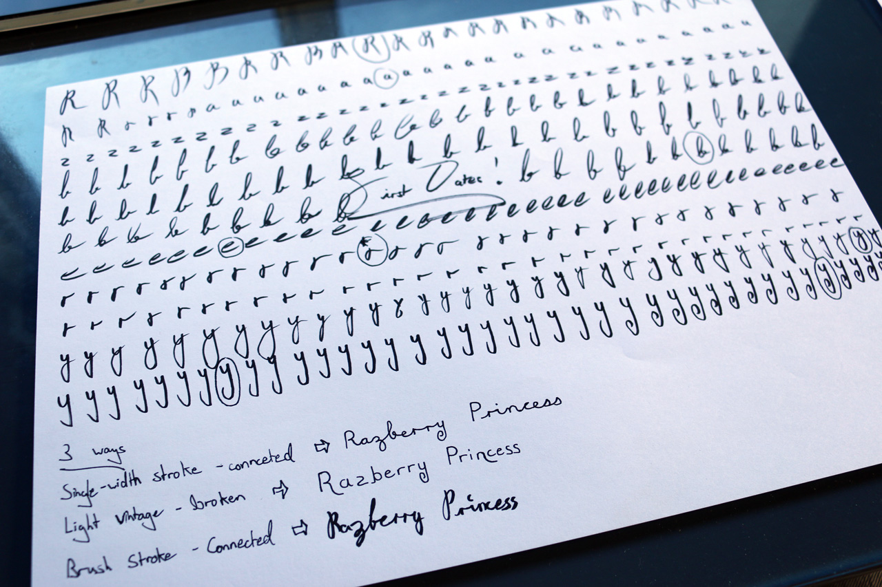
Below are the results of the some sketches from the sketching phase, including a page of brush lettering where I practiced different styles of letters from the word ‘Razberry Princess’. The circles around each letter indicate the style/shape of the letter which I liked that would be drawn by pencil in the final lettering design. I did not choose to go in this ‘brush lettering’ direction with the project after receiving feedback regarding its legibility.
See images below;
The Solution
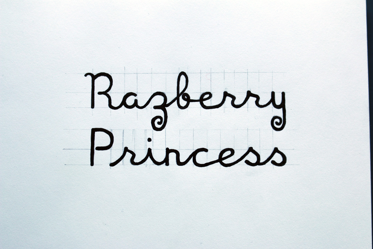
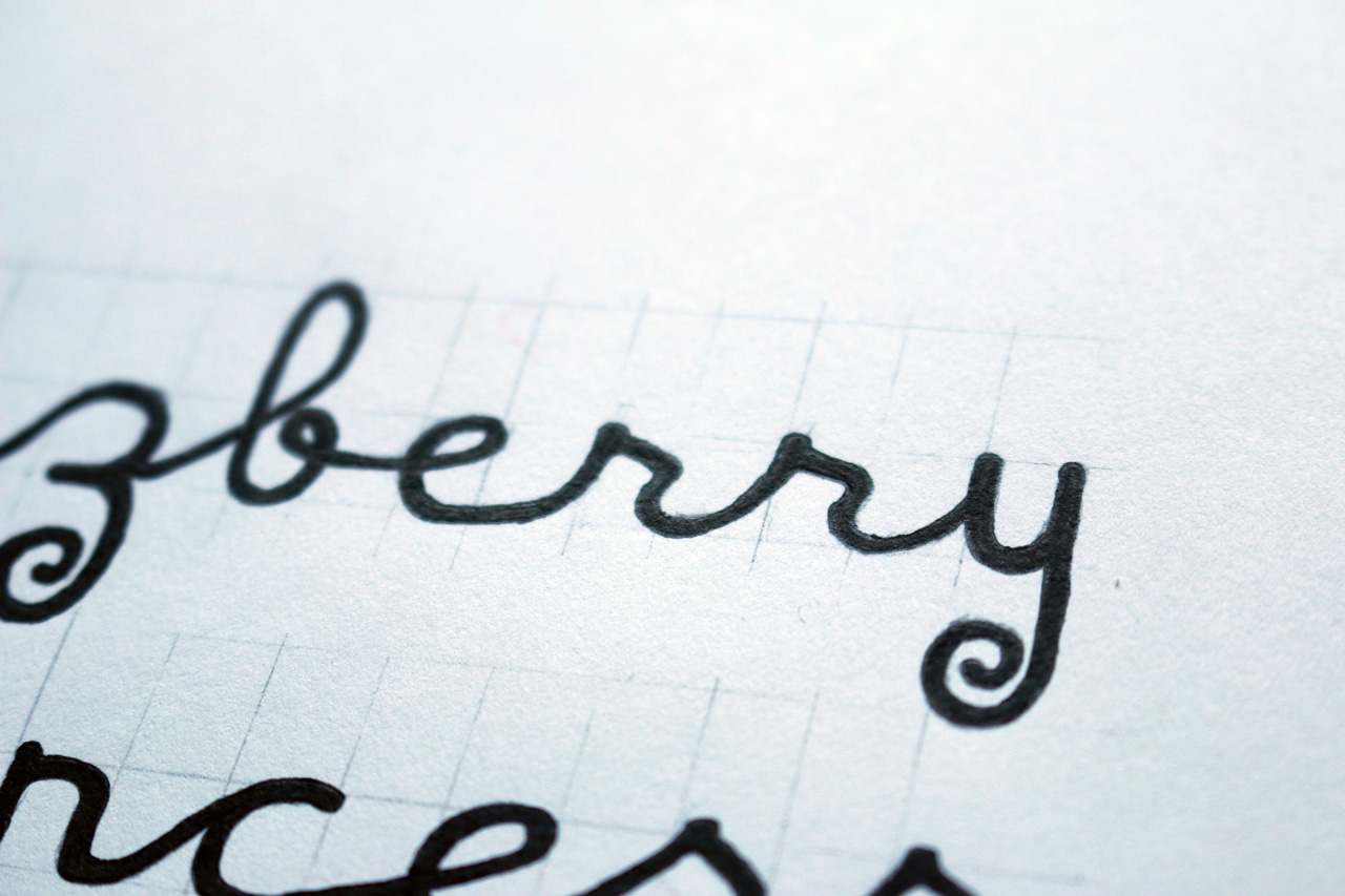
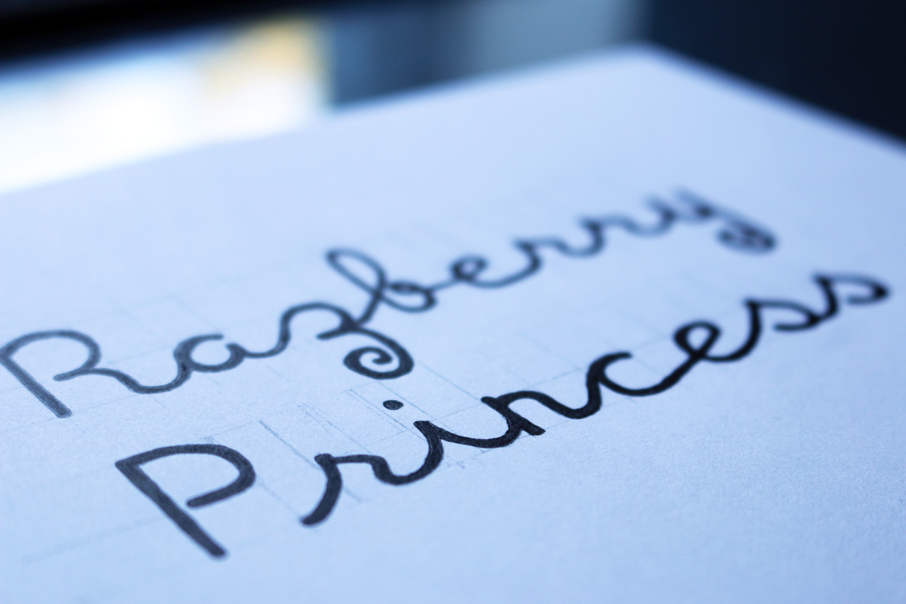
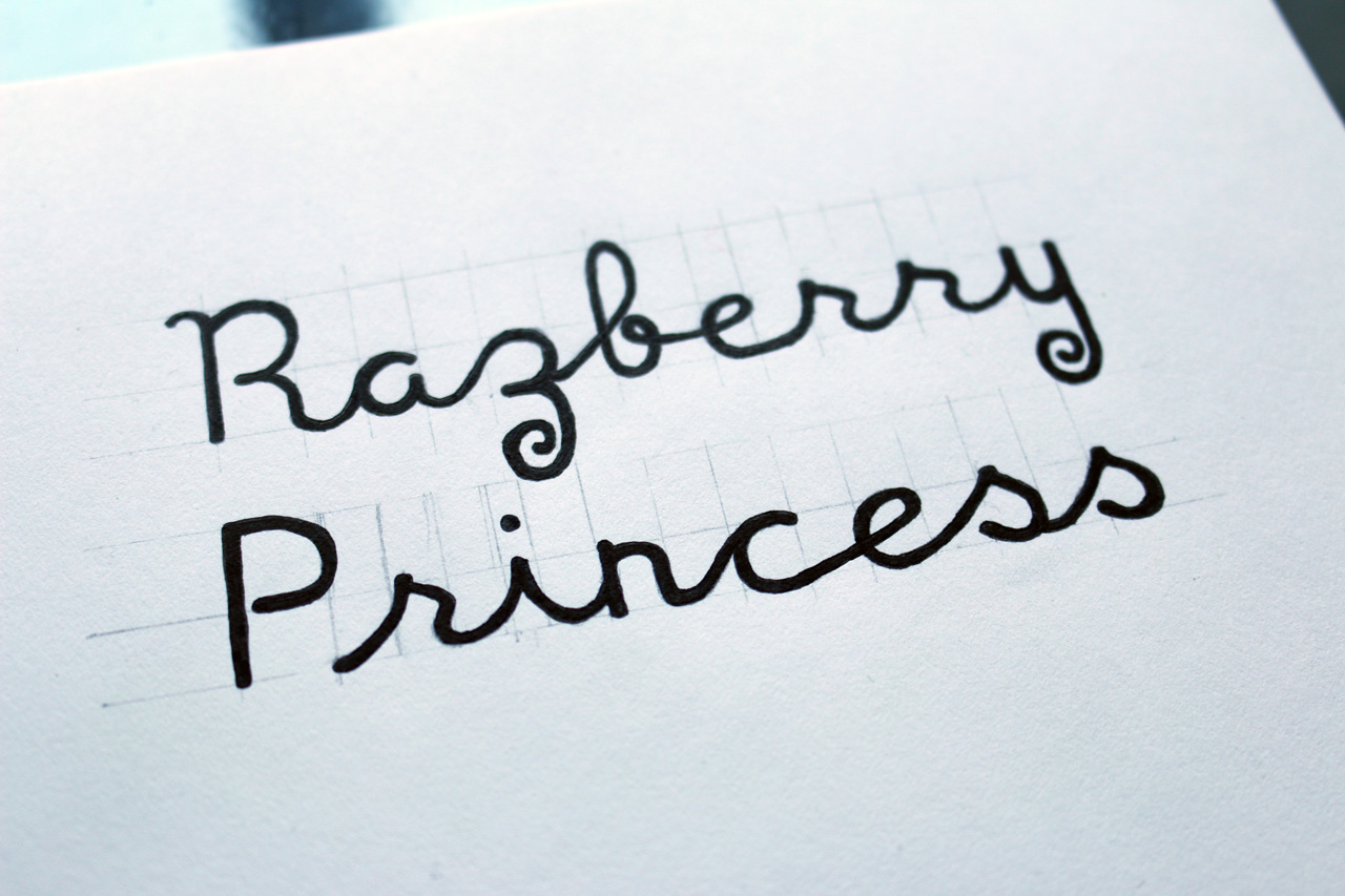
After printing out and testing each of the 3 styles for the direction of the project, it was clear that the ‘Single-width stoke – connected’ was the best solution. It was more legible at smaller scale, maintained a homemade aesthetic with a touch of elegance from the joined ‘handwritten’ style. What followed was sketches of the style with a myriad of variations to how each letter connected to one another. Would the tail of the ‘y’ come underneath the whole word and over to the ‘R’? Would the tail of the ‘z’ curl around and become the curved ascender of the ‘b’? Would the ‘s’s be looped at the x height?
These were all styles tested, but ultimately, from trial, I decide to go with below. Separate curled tails on the ‘z’ and ‘y’, which attributes to the nature of berry fruits growing on wild, curling brambles of the bushes.
See below;
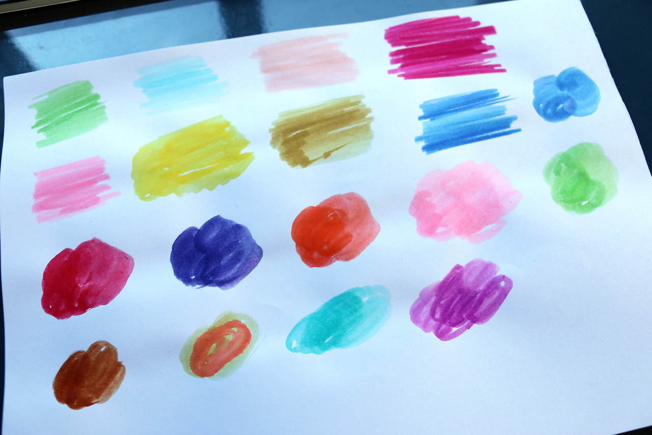
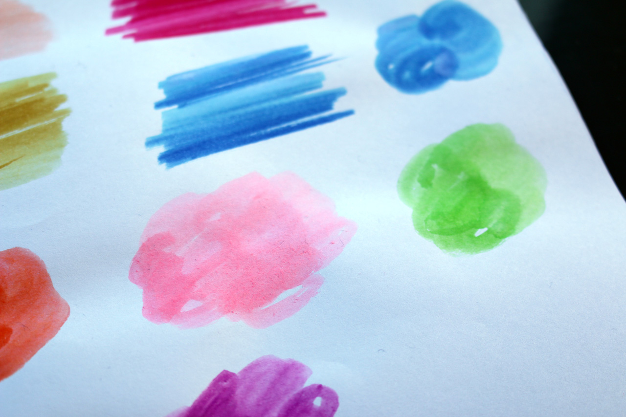
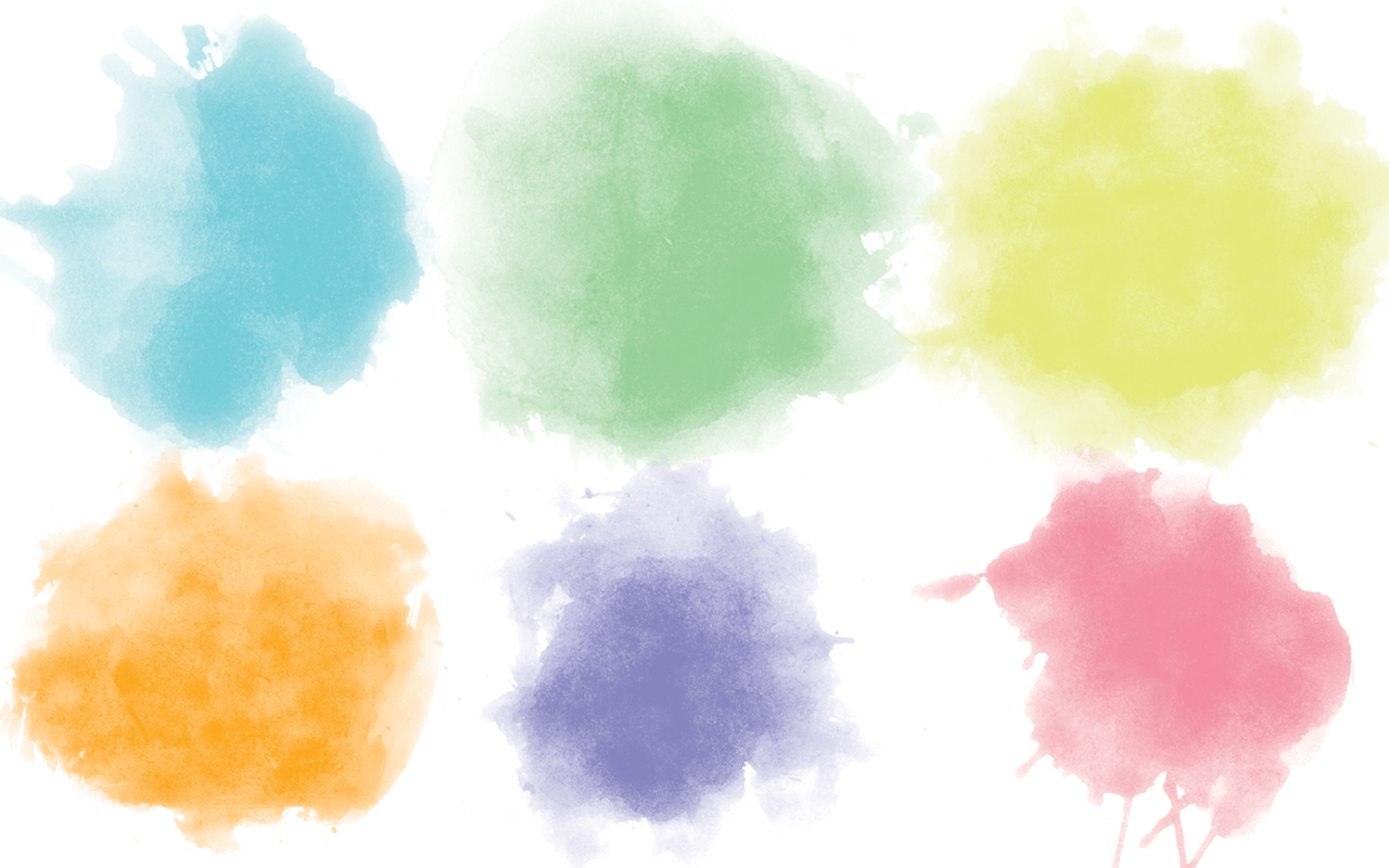
With the lettered logo completed, my attention moved to how it would sit on the jar. I knew the background of the jars would be white, and the logo was all black. This was a great opportunity to trial some colour with the background of the logo. My first instinct was to think of watercolour. It works great with organic, nature-inspired designs. It doesn’t always work of course but because it was a natural food product there as a strong chance that it compliment the design. I began experiment and sketching watercolour backgrounds.
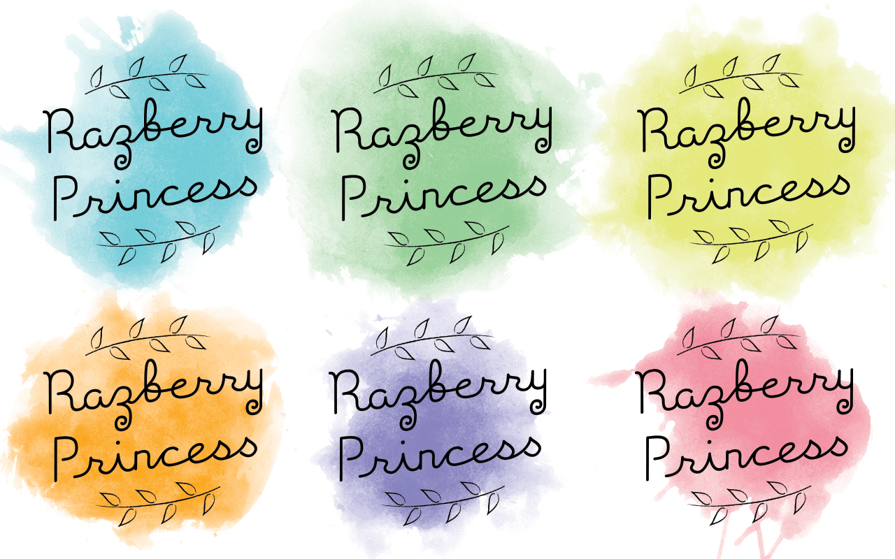
Different shapes, colours and sizes. The circular designs would work better because they would compliment the shape of the logotype. The colours which would be used with each of the packaging would be to determine each flavour ie., blue for blueberry, red for strawberry, orange for marmalade etc.
The watercolour would have to remain subtle in colour and not detract from the logo, rather compliment it and add to its selling power by including colour in the packaging, via visual cues to determine flavouring.
Below are sketches of the watercolour styles;
Relying on visual cues to sell your product isn’t a good idea, people need to be told what they are buying, it needs to have text with the name of the flavour clearly readable in the packaging.
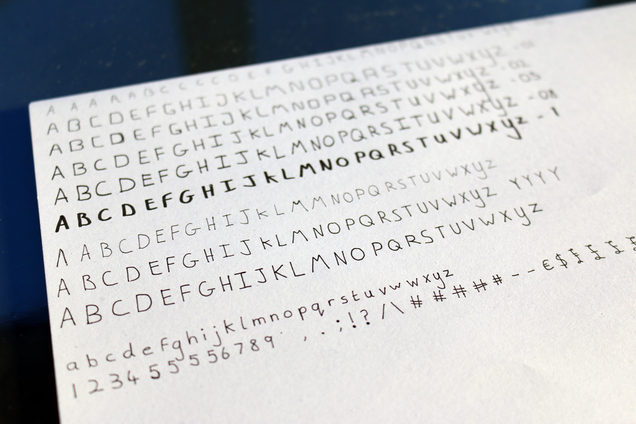
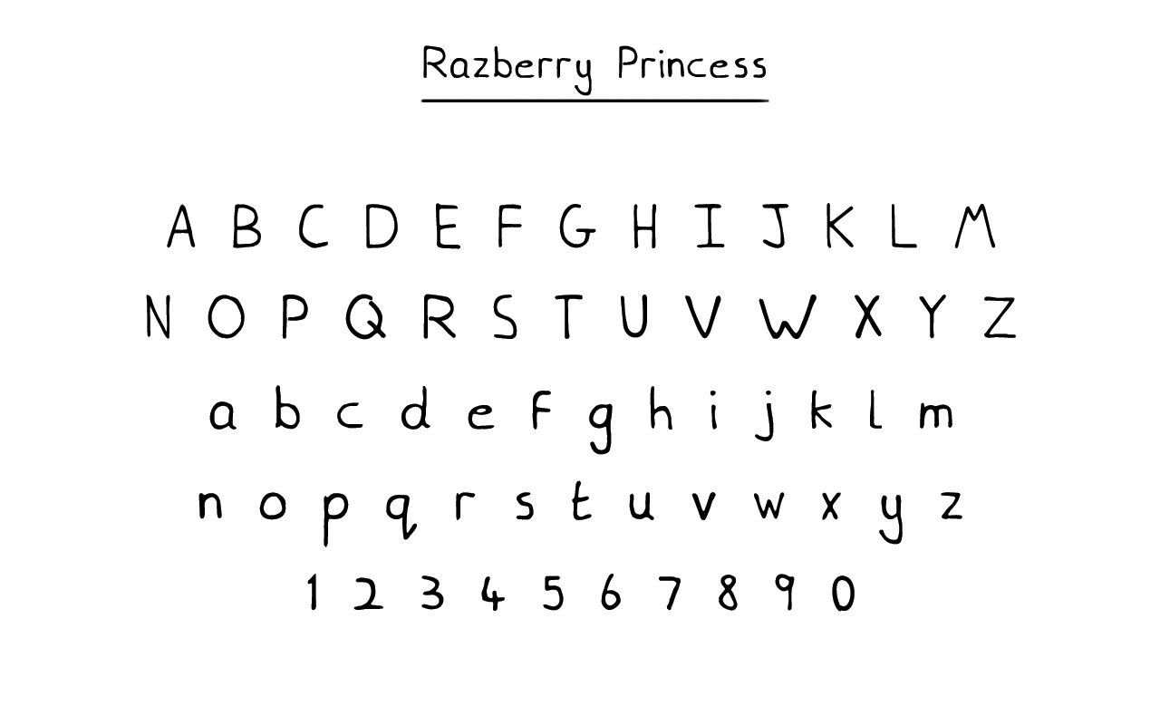
This is where I took the opportunity to create a new font for the project, to be used specifically for the packaging. This was the first font I have ever created. I knew what was involved in the creation process, but did not know the software which had to be used for creating the font. I had to learn a brand new piece of software in the middle of the project, which took about a week in what was a 3 week project to complete.
In hindsight, if I knew it would have taken so long to complete, I probably would have used a premade font, but then it wouldn’t be a custom-made font made exclusively for this project. The aim of the font was to attain a handmade style, which would look as if someone had taken felt tip pen to the product and written on the packaging.
I began sketching the style I thought would be most suited for the project which complimented the logotype. At first, I tested squared letters as seen in the 2nd row from the top, but didn’t feel natural enough. As I proceeded with styles and weights, using a Micron 02, I can to the result I wanted. A thin stroke, handmade style, which complimented the logotype. The final design would then see the font be used in ‘all caps’ to display the flavour.
After the project finished, I then released the font as a free download.
See images below;
Final Design
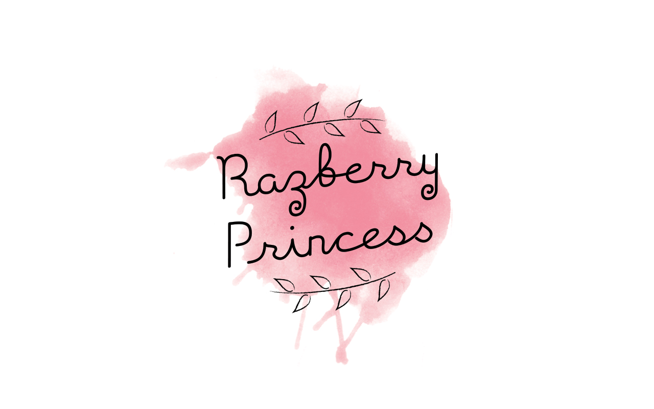
The hand-lettered logo would be brought into Adobe Illustrator to be shaped, refined, tracked, kerned and traced. The letters in the digital version appears closer together in the final design. Below are shots of the logo (lettering & brambles) with watercolour underneath and with paper texture as some would appear on the packaging itself.
The logo offers a natural, organic feel complimented by the surrounding elements. The single-stroke, handwritten connection flows smoothly in an upward motion from left to right makes the piece more interesting to read as opposed to if the extra elements and text were centre aligned, which gave a ‘blocky’, ‘manufactured’ feel to the piece as a whole. Which is why the skew was adopted.
See images of the final piece below;
Conclusion
The result of the project was a success, with all aspects of the brief met with the final design. A brand new font as a result of the project and a new piece of software learned.
As you strive to learn something new, even while working hard.
Return to the top if you want to see what the design looks like on the packaging.
