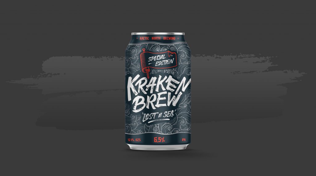
Kraken Brew – ‘Lost at Sea’ Special Edition
I was approached by ‘Arctic North Brewery’ to create a special edition can for their 5 year aniversary. They had seen my work on my social channels and wanted my style of lettering for a one-off special edition.
ANB is only a small brewery based in Boston, US. The guys gave me total creative freedom with the brief only specifying that it had to be a nautical theme, as is their existing style of branding, but could feature as much lettering/illustrations as I wanted.
I took them under my creative process; asking them had they any pre-existing ideas or styles they liked thus setting
Designing the Can
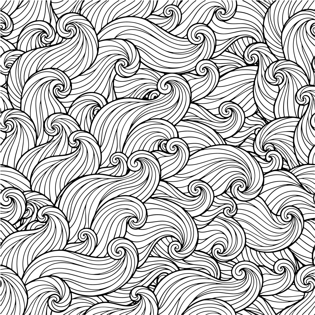
With the nautrical theme, my first thought was what kind of texture to have on the can surrounding the lettering and arriaved at the idea of crashing waves and sketched out so ideas of what a seamless wave texture would come out like. I looked at adult colouring books and how they use seasmless patterns and this was the inspiration for the style of artwork – rugged & handdrawn.
The lettering aspect of the can, the main attraction, was where people’s eyes are going to draw most, so I wanted it to take a large portion and had to captivate while sitting within the nautical theme. Going with the crashing waves idea, I lettered a wordmark ‘Kraken Brew’ in a broken/shattered wood style. With the idea that the wood of a ship had been wrecked against a rocky coastline with the waves crashing.
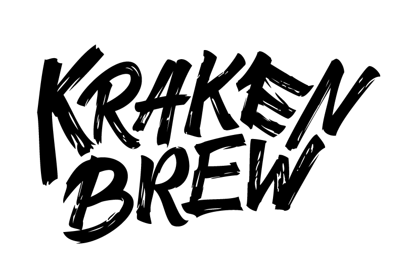
The theme of the waves, battered wooden texture of the lettering, and the name ‘Kraken’ all fit perfectly well with each other. The play-on-words of Kraken/Cracking Brew was also very smart, so good job to ANB for coming up with that.
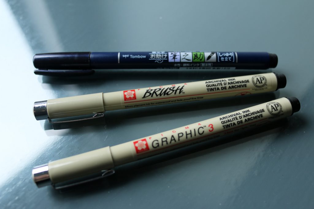
The ‘Kraken Brew’ lettering was created using an old, dry graphic Micron pen I had, it was perfect for getting the wooden texture in the letters itself.
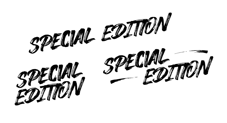
The accompanying lettering ‘Special Edition’ and ‘Lost at Sea’ were made using a dry Tombow Fudenosuke brush pen.
The navy primary colour felt at home. I dabbled around with dark grey on the can. There were only a few secondary colours with the nautical theme that really felt like it complimented the navy. I looked at gold as the secondary but had already settled with silver/white as the tertiary (the waves and lettering).
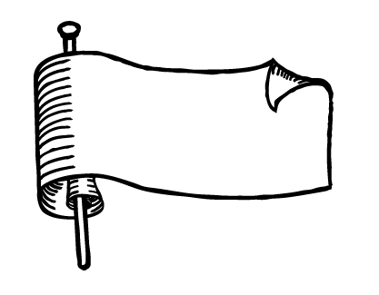
The red secondary colour complimented the navy nicely while giving the can more depth and direction for people to look at. Using it as a framing device on the top and bottom and also using it as the flag colour to frame the text and create a distinction from the main ‘Kraken Brew’ lettering.
The addition text for the beer can is created using the fonts ‘Hellfire’ and ‘Junkdog’. Such as the alcohol level, the beer type and the logo for the company (which was given free reign outside of their usual branding).
Conclusion
With all of these elements in place, this is the final can design that ANB signed off on. They were really pleased with how quick it took to get the
If you would like to talk about designing a beer can for your brewery or something similar, reach out and we can have a conversation – Contact
