‘Change is upon us’
JB Lettering Rebrand
Looking back and seeing where I was 4 years ago when I first started my own brand, designing badges for my day job, and where I am now – A confident lettering artist taking commisioned client work, and involved in various communities of other professional letterers around the world. It’s time for a Lettering rebrand.
The reason for the rebrand is the same reason any business, big or small, decides to rebrand – Change. Businesses and individuals change and adapt over time and evolve into something greater. For my own brand, that meant a change in artistic direction, but not compromising on the values that I hold, or what the brand stands for; Honesty, integrity, and transparency.
When I look back on the kind of designs I was making when I first came out of college and but before I wanted to focus on something specific, I spotlighted a day job as a designer. The badges I was designing in my day job featuring ‘flat design’ with various these for the sales and events we were running on the site. I loved designing these little badges. It was a small space to overcome, and we (our creative team) came up with some cool little ideas.
This was before I knew anything about building a personal brand, and creating a repour amongst other similar designers and peers in your field. The more I worked in the design industry the more I became aware of how the design industry worked and began culminating a knowledge of what styles I liked and the designers I liked. Reading design blogs, watching videos, and consuming podcasts I became aware of what I needed to do to. Then at the beginning of 2014, with barely a blog or personal work to my name, I knew I wanted to focus my attention on one particular style.
This is when I chose Lettering.
Old vs. New
Back when I first began my journey into lettering, I knew I was starting fresh, I wasn’t going to have all the answers or skills in lettering to create a beautiful lettering brand. I was still fresh in the design industry, only having less than a year of full-time experience under my belt. I hadn’t been exposed to artists or communities, I had no entrepreneurial knowledge of how to run a brand, or how to market myself in an online sense. All I had was a crappy blog with some dodgy college art that I had put on there, posting erratically, of this that, that, and anything I thought was relevant to creativity that happened me, like when I got a new camera. I had silly little papercraft models up there, bad vector art of comic strips I made in college using Flash.
I scrapped it all. Straight in the trash. It was trash anyway, it was nothing that I could be hired for and nothing that was going to do my new personal brand. I wasn’t a papercrafter, a Lego photographer, a sound designer, a music producer, a comic strip animator, and all of the other multimedia outlets I had dabbled in for the last few years. It made no sense for that to be in anyway associated with me in my new focused direction. Unlike when you start a direction and can see the work you made at the beginning so you can measure how you’ve grown at that skill.
I needed something, as a placeholder, something visual to represent my new brand. At the time when making badges were the most fun element in my design life, that’s what I created as my original logo. And now look how far we’ve come:
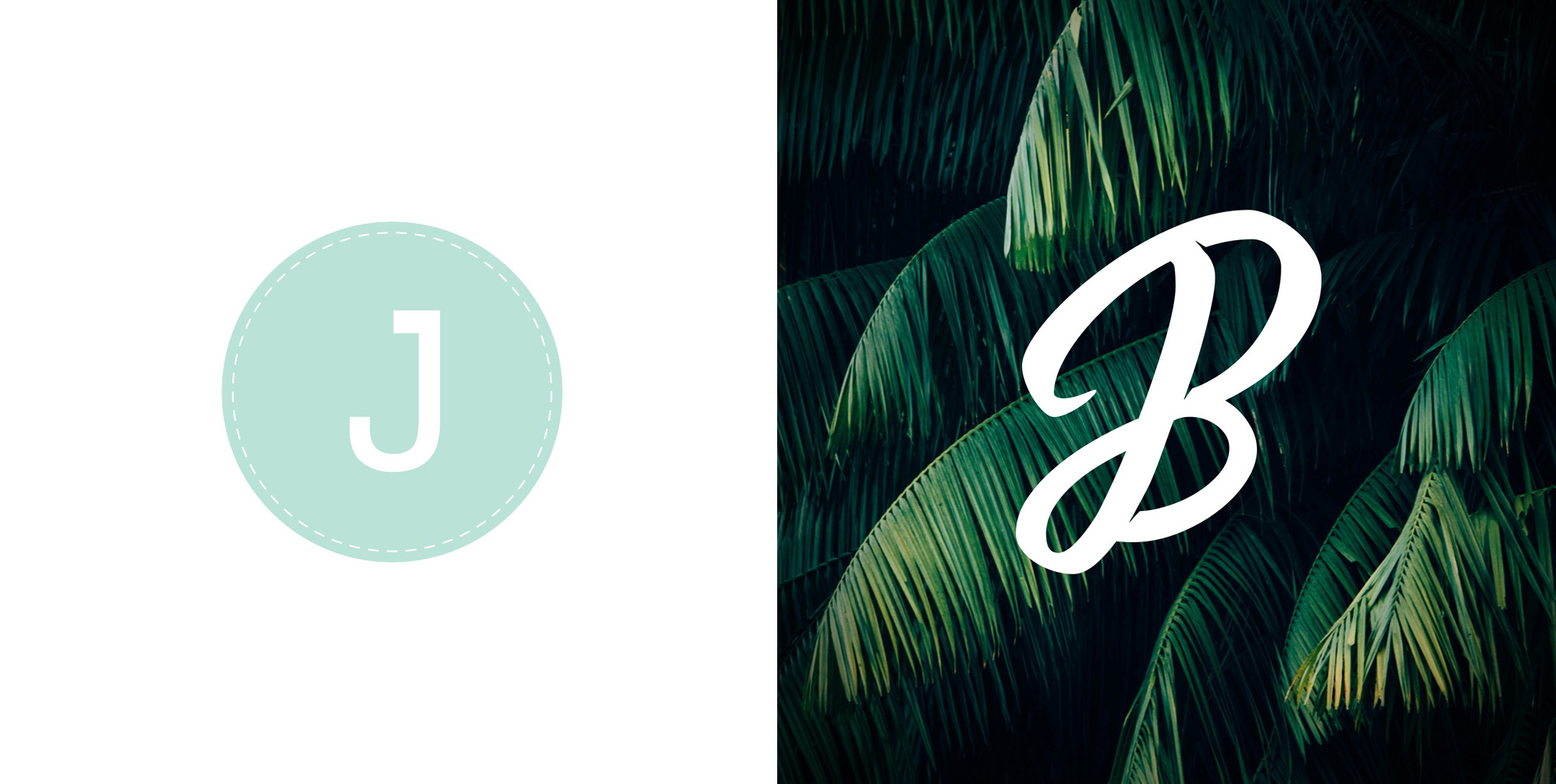
The vast difference between the old logo (left) and the new one (right). It’s easy to look back and scrutinise old logos, but always remember that they were chosen for a reason, for what that brand needed and how it represented the brand’s best interests at that particular time. I’ll be the first to dismiss my old logo. I wasn’t too hot on it when it was first baked, and now I’ve grown out of it completely. To the point where recently I didn’t want to use it for any of my personal branding – emails, business cards, social media etc. So I knew a change was necessary.
The old logo’s ‘J’ was made from an upper case J from the Tahoma typeface, with the terminal extruding from the ascender. With a pale (weak) pastel green. I remember animating this by hand in Flash, this is how old it is. The green isn’t the problem, I still like it, just not the shade. It’s too milky, too distilled, it’s not strong or impactful like how I feel about my new brand. A comparison of the old green and the new green:

The new logo encompasses everything I stand for at this point in my lettering life. (Notice I didn’t say career. I’m not making a living from Lettering at the time of writing this). Its curved, casual style is exactly the style of lettering I create and look for in others work when looking at other lettering artists. It excites me, in both my work and in others. Otherwise, what’s the point? Why make something you’re not excited about?
The Process
To get this brush lettering effect it starts with, well, a brush lettering pen. A Zebra Fude Brush Pen to be exact. Sketching out monogram signatures hundreds of times in a bid to get one that you like the shape of enough to bring in an edit in Illustrator. I already knew I wanted a ‘JB’ monogram, and luckily my initials make a perfect transition from J to B to look smooth and effortless unlike a lot of other letter combinations, so I wanted to take advantage of that.
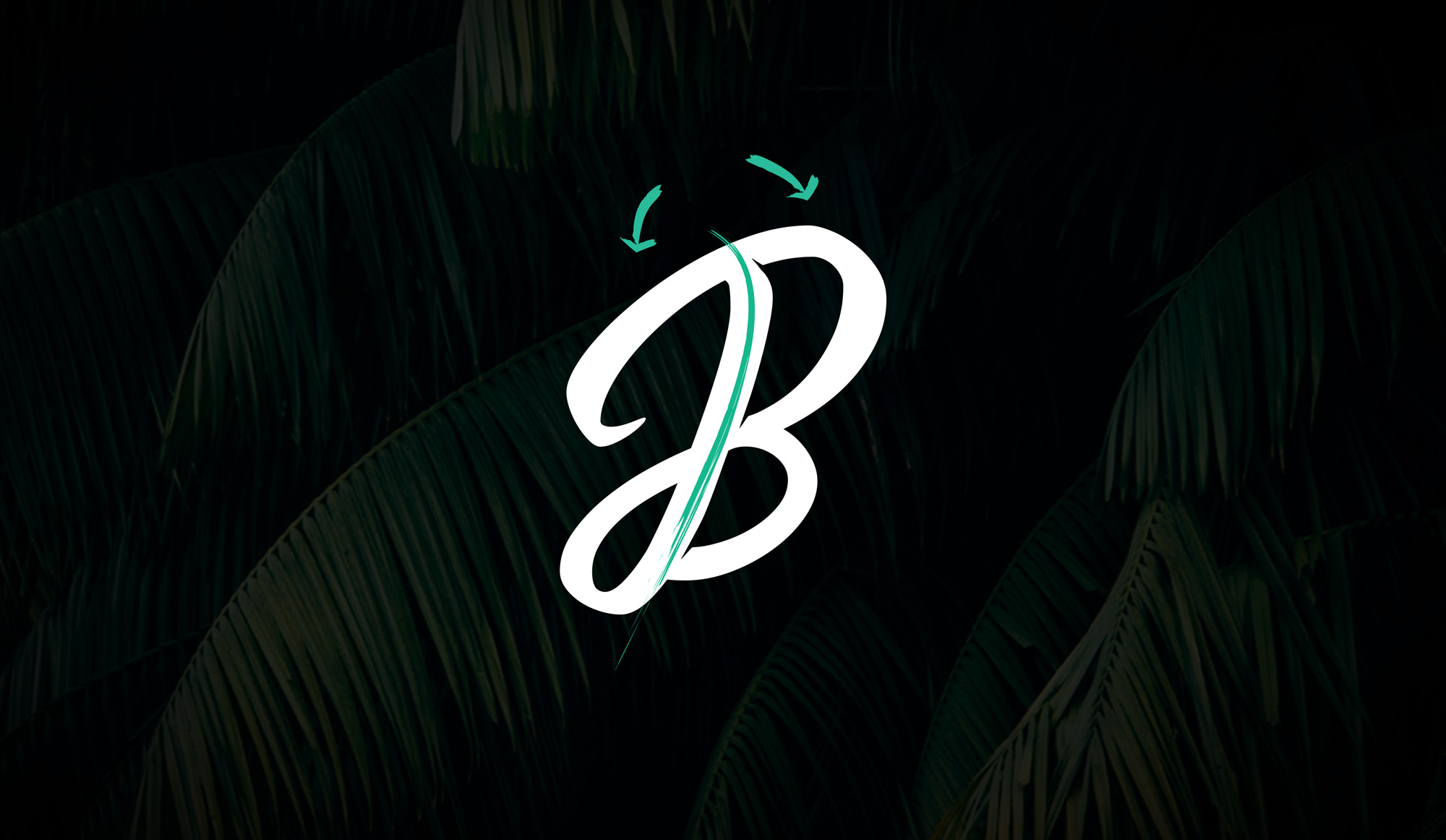
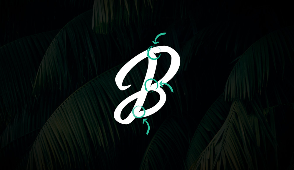
The image above describes the monogram morphing effect I mentioned. Both letters blend into one and divide down the stems of each letter. This effect is emphasised by the indents between at the separation of ‘J’ and ‘B’, making it easier to tell the two letters apart. Making the indents large enough to work in reduction on various formats too. Below is an image of the indents mentioned.
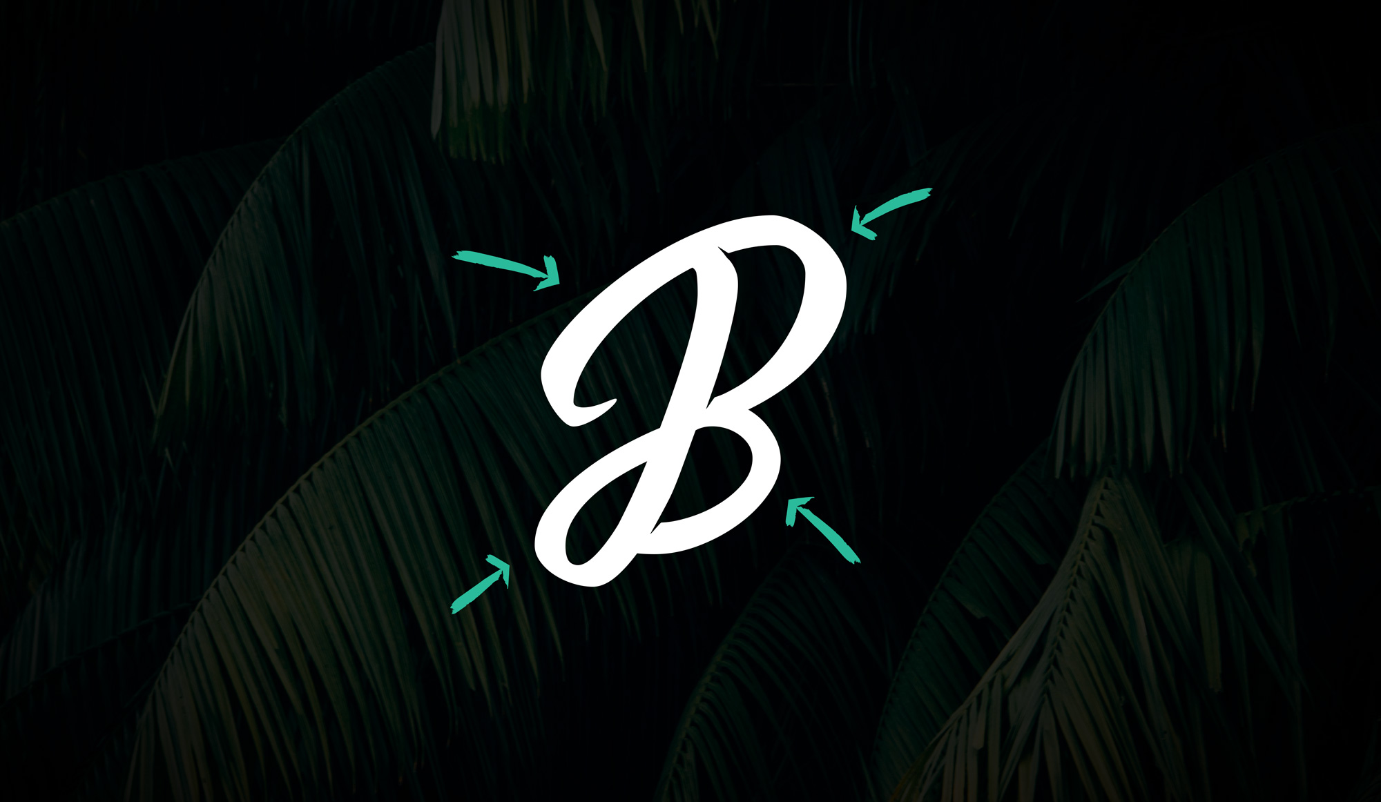
Another feature of the image is its shape. It rises from a slant going from South West to North East. The shape is divided into 4 quadrants. A rounded almost ‘wing’ like shape. A homage to my name, ‘Butterly’, which often gets mistaken for ‘Butterfly’. Two large wings at the top and two small wings at the tail end. Initially, I hadn’t realised this when I was sketching with pen on paper. It’s only when I was tracing it out in illustrator did I realise what I had just done. Revelatory. I decided to keep and use this curvature of the letters to encourage this symbolism to my name. A more personal meaning. See image below for clarity.
Typography
My lettering style is predominantly brush lettering. I do occasionally create custom lettering logos that aren’t in a brush style. See my ‘Savage‘ and ‘Secret King‘ logo projects. I need a typeface that represents my brand, something to visualise everyday assets. Letterheads, cards, invoices, and various other marketing collateral. I took some time thinking about what typeface to chose for this and ultimately wound up back where I started, with the font I used in my original branding – Grota Sans.
It does everything it needs to, it’s a strong, modern typeface with a beautiful alt version that fits perfectly into the brand. Here is an example of it – Grota
Images
With the new brand comes a new visual identity. For it, a sense of freshness and of nature. I love floral patterns and designing with flowers. It’s become part of my signature style for my personal work more so that my professional work. But this is an association that I want to use for the new brand. A combination of floral imagery and brush lettering. Roses, tropical trees etc. feature heavily in my brush lettering, (example).
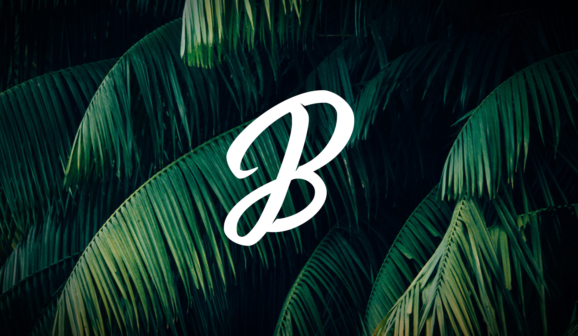
Images of tropical, big leafy trees, and roses, with tints of blue and dark are prominently featured in new branding. Such as the background of the logo here. The darkness of the image allows for a white overlayed text to be perfectly legible.
A Fresh Start
Melding these aspects together, the lettering logo, the imagery, the typography, the brush textures of the branding, like the decorative arrows in the images above, I’ve made a new brand that I feel excited about. Something that represents where I am now in my lettering journey. This redesign is not a new direction, but a fresh encompassing of what I already stand for while introducing a more focused brand. One that focusses solely on Lettering, brush lettering specifically. This is the client-facing brand.
On the other hand, there is now the customer-focused brand. At this point, I would like to introduce my online shop. A place where you can order limited run prints, stickers, pins etc. from of my artwork. With this side comes product packaging collateral. Labels, mailers, cardboard toppers, that all had to be considered.
The shop will be written up as a separate case study to show how I tackled the challenge of product packaging, from how I designed it to how I ordered it, and hopefully, it will help some people who are thinking of getting into shipping their own products.
If you’d like to work together on some cool lettering/type projects – hello@jamesbutterly.com
