Pharaoh Coffee Roasters is a French coffee brand startup. They contacted me seeking a new logo for their business. This logo was to be rolled out across their entire business and used as the main image for the brand. The image was to be used on physical products, including their own brand of coffee and tea products, packaging, the outdoor signage for their physical shop front, and the coffee cups in which they serve their coffee. The logo would also be used on other physical miscellaneous business stationary, from letterheads, business cards, pens, pencils, and other branding peripherals used in office environments.
The project also extended to the use of the logo on their digital assets, such as social media uses, for advertisements, and also used for print advertisements in local and national newspapers. Along with the logo, the client requested a website for their brand. The scale of the project was grande, with the logo requiring use in various areas of the business and in different formats and in different sizes. Here is how I took on this project and solved the problem for this client;

Case Study
The Problem
I was approached by the business through social media where they explained that they had been looking around for a designer who creates this kind of lettering work. When they arrived at my social media feeds they said that this was exactly what they were looking for and that we would be the perfect fit to work together. They then emailed me and proposed the idea of a branding campaign to cover all of their needs including, packaging, exterior branding, signage, and various miscellaneous branding uses such as office equipment; pens, notebooks, etc.
They listed down exactly what they needed the project to cover and what it would extend to, both digitally and physically, I told them I had something in mind for the brand. We set down our expectations of what they wanted, what I would do, and when we would contact each other next. I began sketching the project.
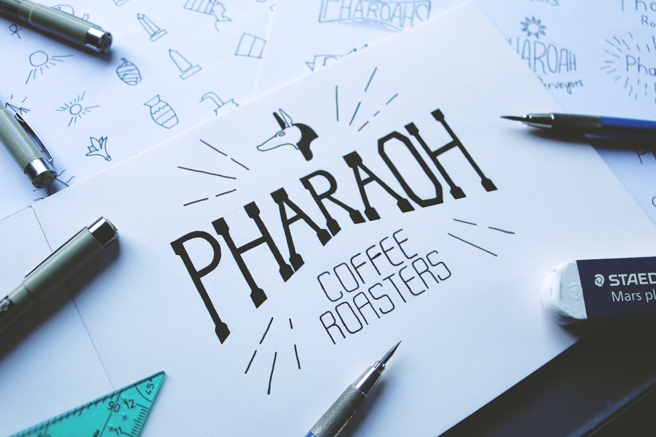
Mailing them back a about 4/5 days later, I had shown them a few sketches of the direction I was planning on going with the project. I showed them icon styles and some sketches of the branding in various different logo styles (Image below).
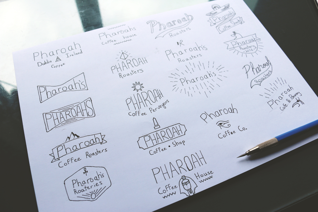
The client was more than happy with the direction it was going, and allowed me as the professional to be the decision maker in the creation process. It’s important at the beginning of the process that you set expectations and allow trust to build between you and your client.
The Solution
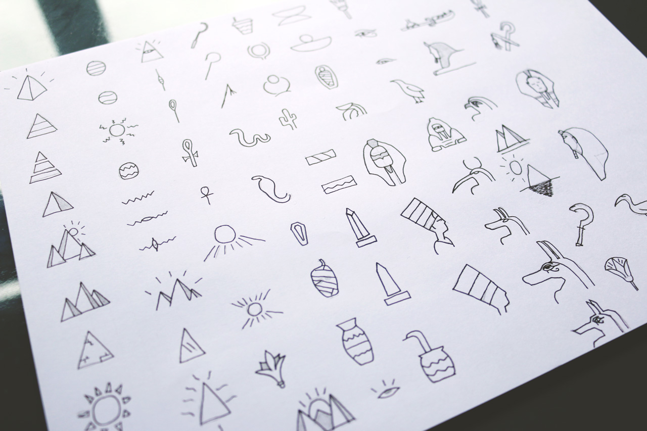
With the sketch phase complete, and knowing the artistic direction of the project. What icons, colours, styles, textures, etc to go with. I started piecing the elements together in various interchanging formats, ie. I had the shape of the design down, I just needed to find out what icons where going to fit where and which one suited the brand.
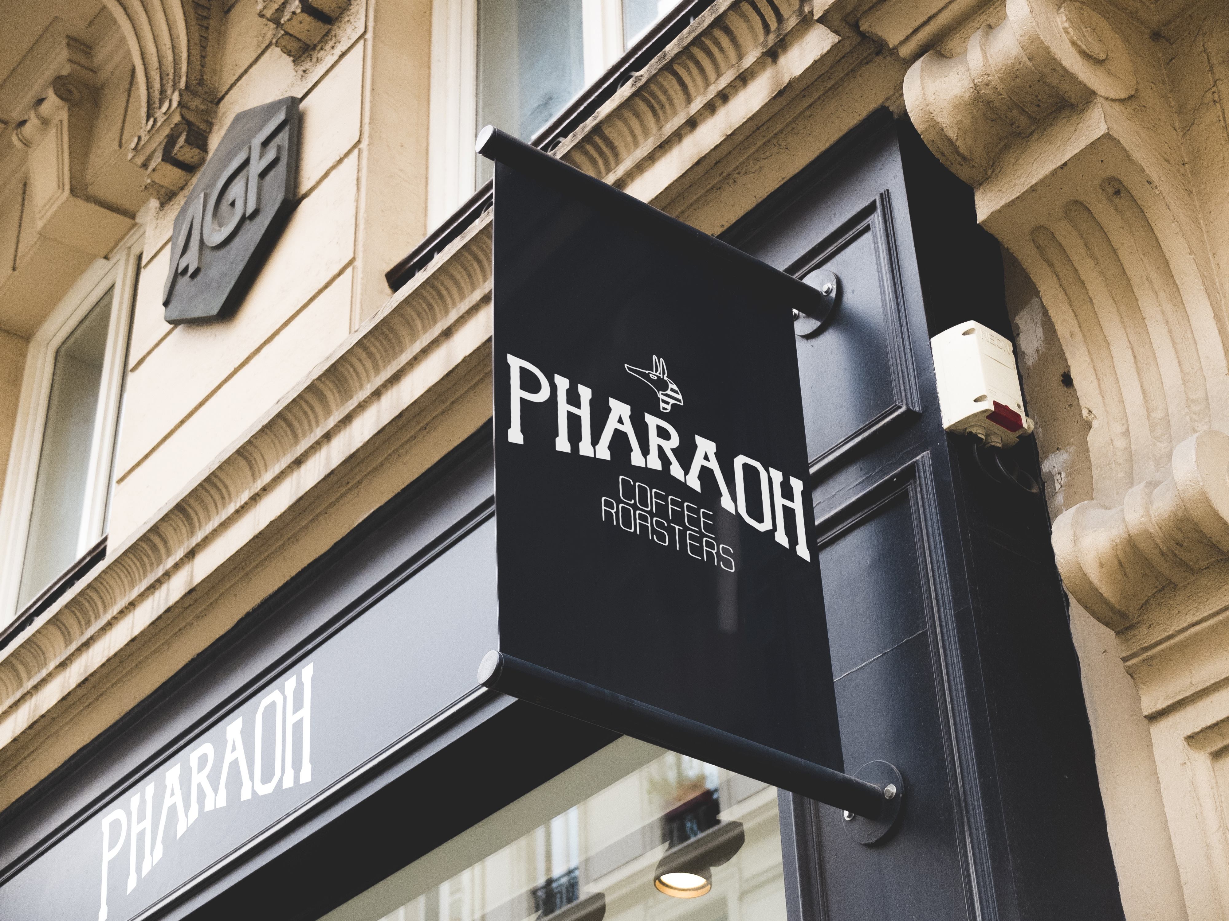
The design style we were going with was (Image – 2nd column from the right, 2nd row). With an icon on top, type in the middle in an arch, with a descriptive lettering piece underneath. The icon would be something that pulls the piece together thematically, and would have to relate to the brands culture. In this case, the chosen icon would be the ‘Anubis’ head, a strong and recognisable figure with ties to longevity in ancient Egypt. The brand was happy to go with a godlike icon and this was the perfect fit for the brand.
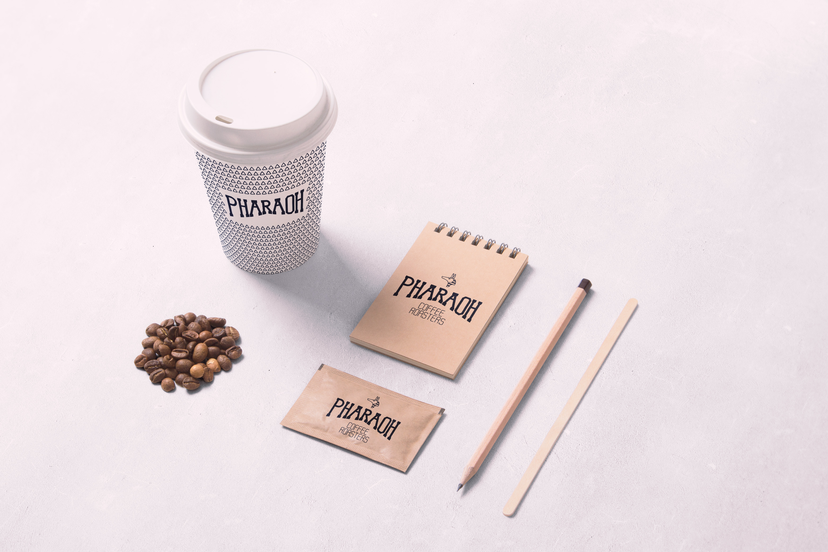
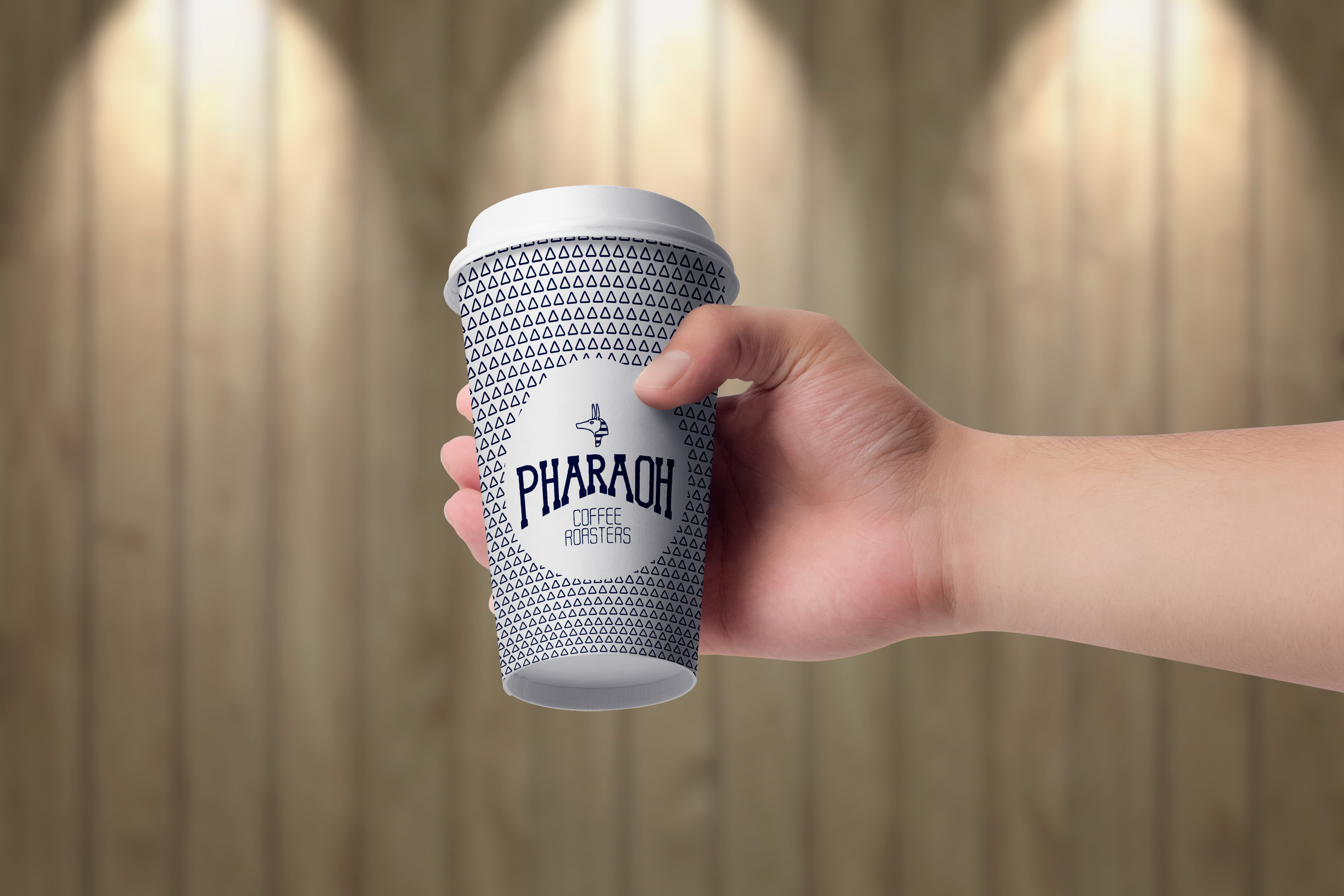
The icon would be used as a standalone logo for the company in some situations so had to be unique in its own right and be recognisable without the logotype or accompanying descriptive text if possible. The client will use the icon on coffee cups, and even as an avatar image on social media. So the icon must be created with a wide array of devices and locations in mind, and also both physically and digitally.
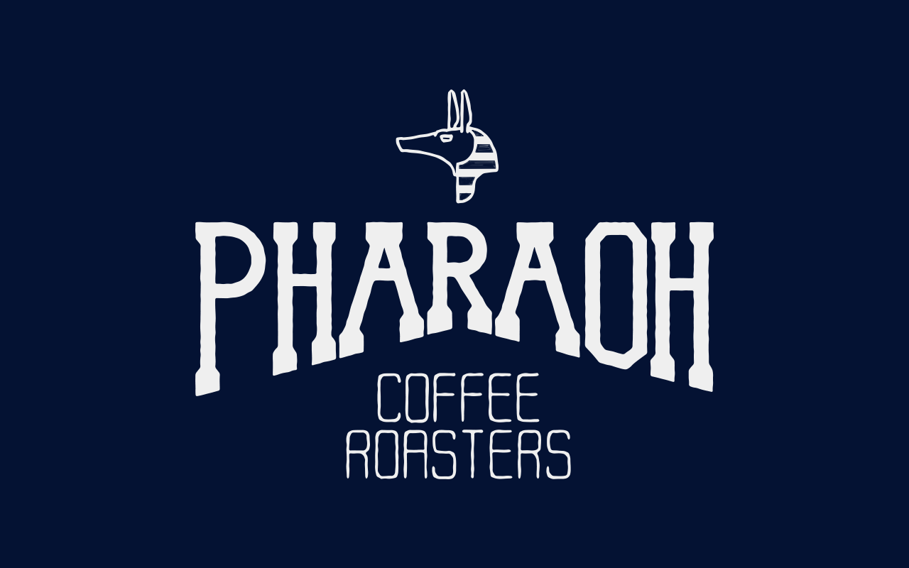
See the complete logo with icon and logotype below.
This was the final version of the logo, minus the sun rays around the logotype. the logo was presented to the client about a week into the project, and after it was completed in its handlettered form. Since the clients expectations were set early on in the process and they had provided extensive information through my contact form, the process flowed smoothly and there was no changes.
After confirming the hand drawn logo with the client, I moved onto the digitising it in Illustrator. This process involves taking an overhead photo of the handlettered artwork, bringing it into illustrator and either ‘image tracing’ the photo, or using the pen tool from scratch to trace the outline of the letters in the photo. A process that takes a lot longer, but is far more accurate, allows for more control and manipulation of the artwork, and thus produces and far better final product.
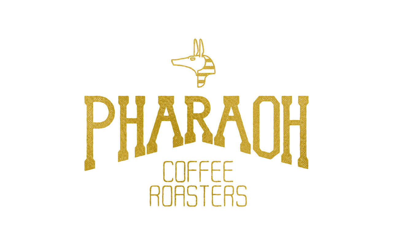
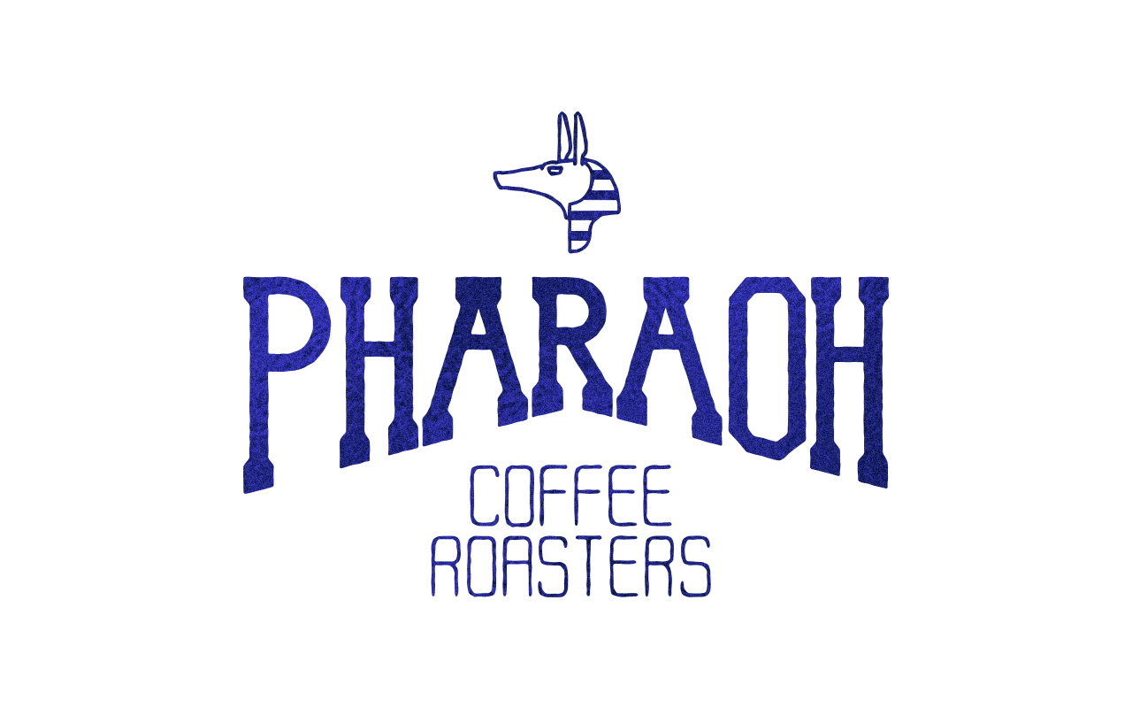
See the vectored ‘Pharaoh Coffee Roasters’ logo below in alternative, inverted colours. Along with the ‘blue sand’ special edition –
With the vectored version complete, the attention was turned to composition and making sure the logo and its various assets (logotype and icon) worked well reduction, ie. on mobile, small print packaging etc. A logo can work well on desktop where it has been designed but it also needs to be tested in different environments before being finalised to send. This is to make sure its legible at small-scale. As the logo was going to be used in various print and digital assets, testing was crucial to the process.
The goal with the lettering logo was to create a hierarchy so that the ‘Pharaoh’ element of the logo was the first part that was noticeable. This was achieved by using a tall, block serif font, similar to a western style. With this bolded, it created the perfect weight in the middle of the design to draw the attention. The icon was also an important element, it had to feel strong and distinct enough to stand on its on, but not distract from the rest of the logo when paired with the logotype. Done by reducing the sizing and weight of the icon in comparison to the main ‘Pharaoh’ element in the middle.
The logo drew the eye to the middle (logotype) then to the top (icon), back the middle (logotype), and finally to the bottom where the light, descriptive tagline lay. The tagline was lettered as light typeface with thin stroke. Worn, and vintage-inspired to reflect the coffee part of the brand to show that they used natural, eco-friendly, coffee beans from fair-trade sources.
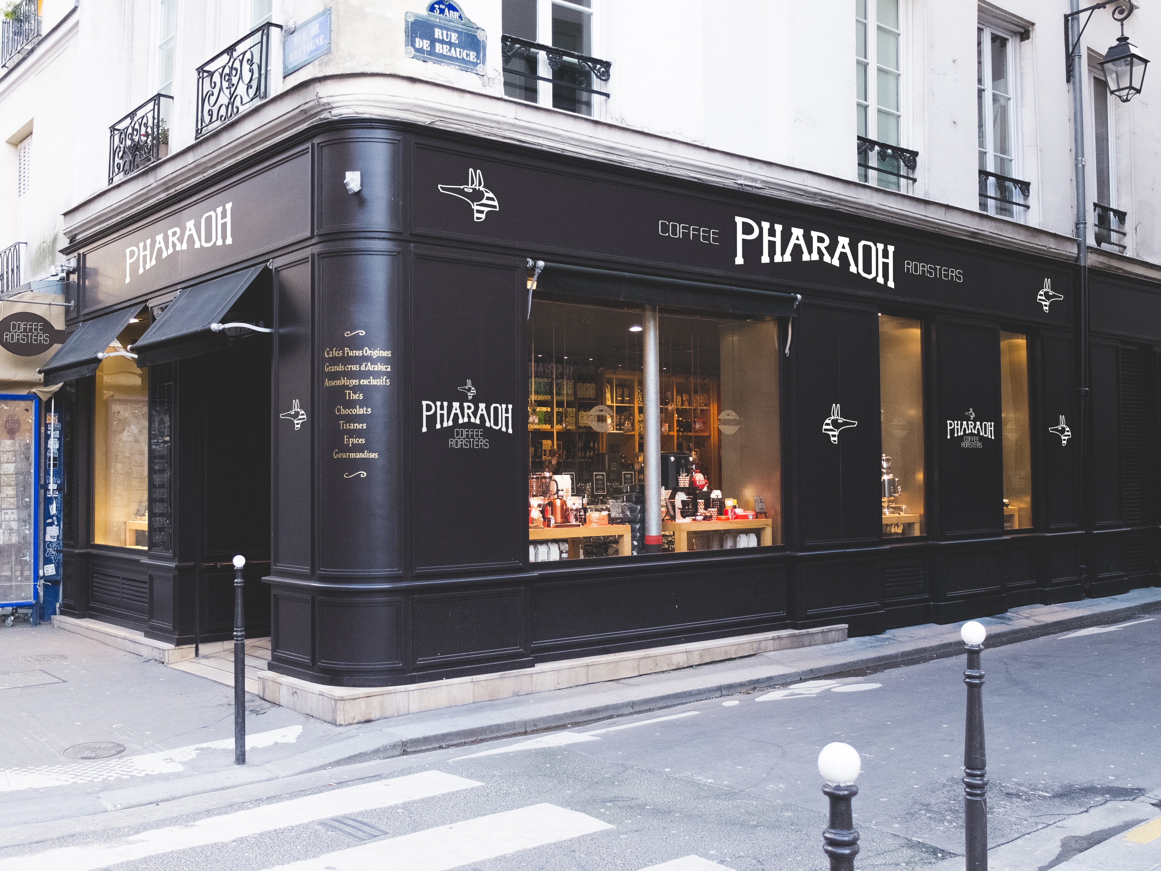
With the logo optimised for different environments, intended for web and print at various scale, I began mocking up products and beginning to rollout the branding of the products to a local printer of their choice. They informed me of what they wanted printed, ie. menus, sachets, napkins, for the restaurant. Notepads, pens and pencils for their offices, and some larger-scale vinyl prints for promotions and a large vinyl print for the signage of their coffee shop. I insisted that they hire a local sign-painter to draw the logo by hand to make it more authentic and longer-lasting as the vinyl may fade/wear away while exposed to the elements.
They also wished for the logo to be printed on canvas to be used as a flag outside of their coffee shop. See the signage below for the flag and the external branding for their building;
The client was happy with the final logo and their printed material. They were in the market for a website at the same time and asked if that was a service I offered. I told them it wasn’t normally something I would do, and that lettering and branding was my sole focus but I did agree and we adjusted the price of the initial logo design to include a website for their coffee brand. See website below;
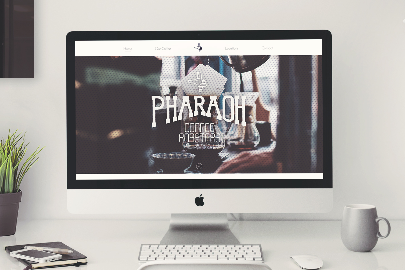
They wanted a simple website with a few static pages about their company, who they are and what they offer. Pretty simple in terms of website design. There was nothing too intensive to merit a separate project in terms of their goals for the website. It would have been an entirely different / separate project if they wanted an extensive website with the ability to buy/order products, manage mailing lists, logins, subscribers etc. If this was the case, a whole new conversation would have to be had around their goals, the timeframe would have changed drastically and it would have been a project for a specialist web designer, and not a lettering artist.
Conclusion
From the start of the project, where the expectations were set by both parties, to the end where the payment was received and the files sent on, the entire project flowed smoothly. The key element was asking the questions in the contact form, staying in communication with the client, but not too much that it merited them to see you as someone who needed their approval at all time.
Remember, you’re the professional. You don’t need anyone to tell you how to do your job. You don’t need a client to tell you everyday that they want this changed, or this added. It’s all discussed at the beginning. That’s why you have to ask the right questions to a client; “What are your goals?”, “What’s important to this business right now?”, “What is the downfall if you don’t get this problem solved?”.
By asking the right questions early, you discover the value of the project to the client. From which, you can set expectations. When expectations are set, the client knows exactly what they are going to receive and what it will mean to them and their business in terms of their goals.