‘Moomaid’ – Lettering Logo
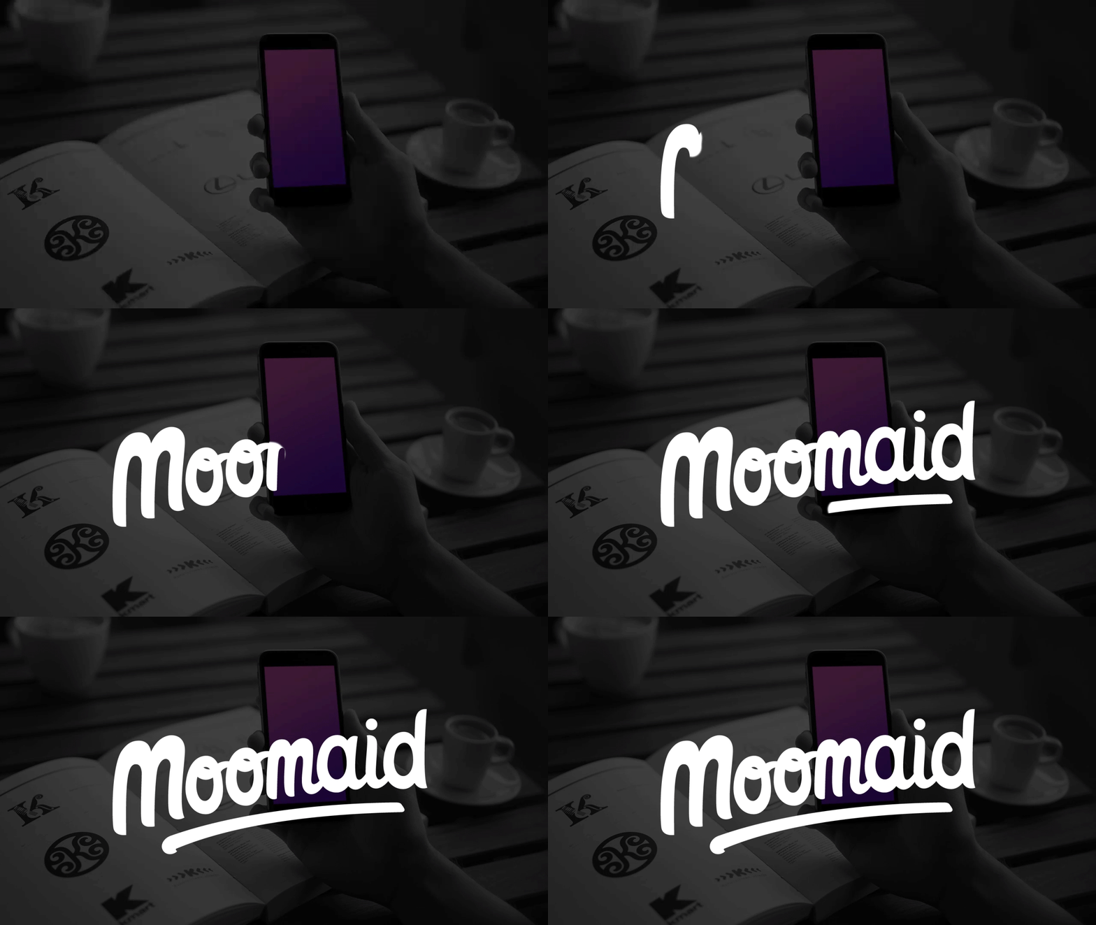
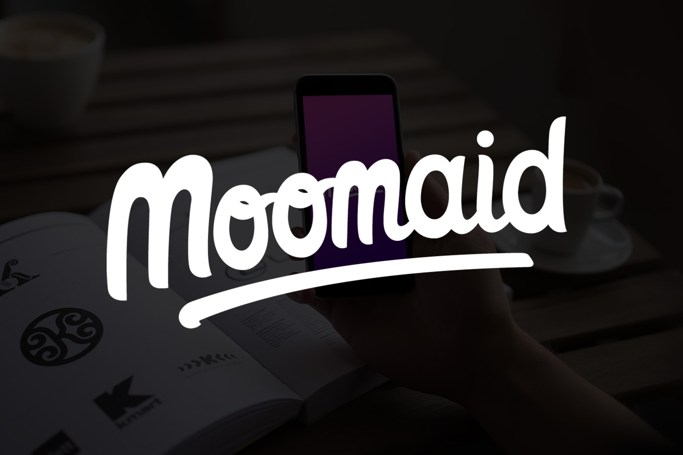
Logo for a tech startup, ‘Moomaid’, a milk delivery app. The business required a new logo, something with a liquid/fluid aesthetic. The logo is playful and informal with the type arching upward with the classic ‘dash’ underneath, further emphasising the fluid motion of the logo.
The logo was going to be used predominantly in their app so had to work well in reduction which meant the connection between the letters had to be thick enough so that the fidelity was not lost on a small screen.
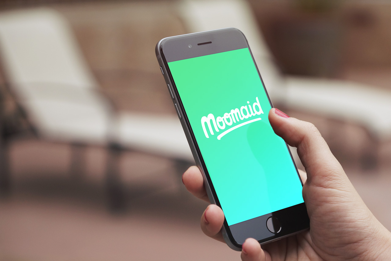
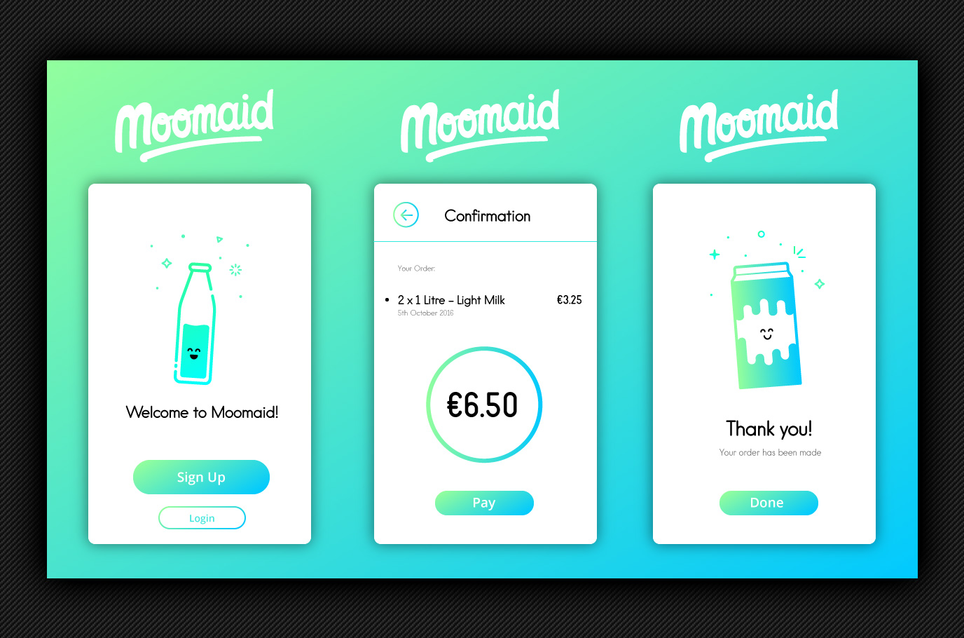
This is the final result, including the app branding.

[…] See the full digital version of the logo here – Final Logo. […]