This tutorial is a supplement to another tutorial I made – ‘How To Digitise Your Handlettering’. If you want to know the steps to getting to where we are going to start here, then I suggest checking out that first before learning how to use the pen tool here.
Pen Tool
The pen tool is arguably the most important tool when editing and creating your vectorised lettering. It allows you to take complete control of your artwork and manipulate your shapes and lines to create the desired look. This amount of control is crucial, as even just a slightly thin swash or flair, one wrong movement of a stem or curve is enough to throw the balance off the entire lettering piece.
Your use of the pen tool is what separates your lettering from amateur to pro. Knowing how to make the piece fluid and where to place points and how to position anchors is key to making your lettering a masterpiece.
The pen tool is effective if you have curving shapes, if your handlettering piece is done as a sans-serif style typeface, you can use simple rectangles to recreate the shape, which saves a lot of time.
Layers & Starting Position

In order to allow the points to look natural, you need to know where to position the anchor points to start. Get your scanned or photographed image and put it on the bottom layer. Create a layer over this bottom layer and set the opacity to 50%. I recommend creating different layers for each letter in your overall piece.
Pick a starting point on the edge of a letter to create a point. If you are familiar with the pen tool you will know how it works and how it connects each point. When you have picked your starting point, follow the outline of the physical handlettering on the layer underneath. The next point you create should be when the letter changes direction.
Using the ‘compass rule’, every time a letter changes direction and goes in a North, South, East or West direction, this is where you create you next point. For example, with a ‘O’, you should have 4 points, one point each time the letter changes direction. This happens 4 times. This is a simple example, for more complex letters such as ‘G’, ‘Y’ etc. this can become harder. But remember the compass rule with directional changes and you should have your points in balanced positions.
Anchors & Handles
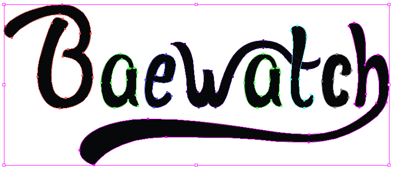
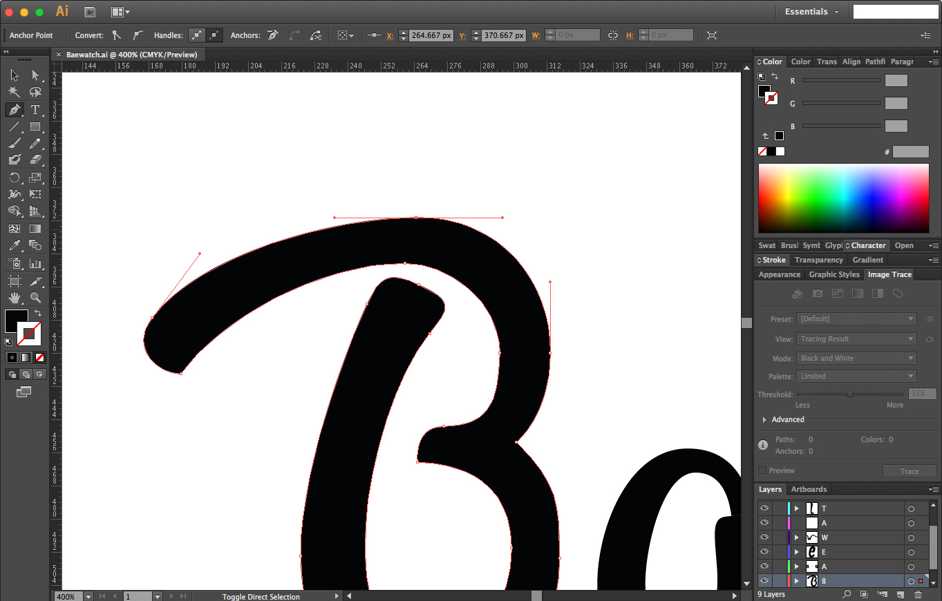
To get your vector lettering to flow in a natural rhythm and retain it’s balance, a thorough understanding of the positions of ‘anchor’ points and ‘handle’ relationships work. Anchors points are the square boxes you see on the edge of your letters (See image above). Click ‘A’ on your keyboard and you will select the ‘Direct Selection Tool’. This will allow you to select the anchors and gives you complete control to change their orientation, position and curvature.
By clicking on these anchors, you will see 2 circles at the end of a line which goes straight through the anchor point. This allows you to change the angle and curve of that point. In order to achieve a balance between 2 points, use a technique called ‘Go Halves’.
meet a point halfway way, or compensate each point 50/50 when angling or changing its position. This allows you to maintain the balance of the 2 points. Putting too much weight on a point will look heavy and unnatural. Allow the points to balance each other by compensating 50% of the weight between 2 points.

Having a point at each time the letter changes direction allows you to have the right amount of control to allow fluid movement of the letter and make it look natural. With too may anchor points, you add too much complication to the shape, and it allows for extra time to adjust. The less the better, but the most essential points should be on the change of directions on the outline.
It’s easier to place the anchors as you go instead finalising the position of each handle and curve. It makes it easier to see the position of all the anchors and adjust as necessary later on when the letters outline has been finished. The point is to make sure the piece is optically balanced overall.
With overlapping parts of the image. Such as the cross-bar on the ‘A’ etc. it’s easier to make a separate layer/path for those parts instead of including it in the full letter. Again, breaking the letter down to it’s simplest shapes with as little anchor points as possible makes the letter more natural.
Summery & Takeaway
- Use the Pen tool when you have curves in your handlettering.
- The Pen Tool allows you to have more control and maneuverability in your vector.
- Use the 50/50 rule when balancing the weight of each anchors handle.
- Place an anchor at the point where the outline starts to change direction.
- Split the letter up into its simplest shapes and create a new layer for each letter. This allows more control over the full piece of artwork.


