Typography is the study of arranging type in a meaningful, legible, and readable manner to create language. The term is used to describe the arrangement and appearance of letters, symbols and numbers. The art of typography uses a set skill that includes kerning, line spacing, width and height, typefaces, and tracking.
Typography is used everyday, everywhere, and you may not even realise it. By reading this text, the ingredients in your food, the sign on your local store, bills and letters you get in the mail. Everywhere you can read something using the structure of an alphabet and language is typography. It’s not just designers and typographers that use typography. Every time you text, post something on social media, write an email, write a document in MS Word, you’re using typography. That very font has been carefully crafted and designed by an expert type designer that may have taken months, even years to refine.
Even if you’re not a typographer, designer, or letterer, but your work with text on a daily basis, it’s worth knowing the anatomy of a typeface.
If you’re a letterer by trade, a hobbiest, or just starting off. The difference between good lettering and bad lettering is down to a fundamental knowledge of the basics, which starts with the construction of a letter. You need to know the parts that you are going to be referring to, especially if you are asking for feedback on your lettering work, or commenting others work. It’s important to have an understanding of the principles of letterforms as this is what you are going to be creating. You should even revisit the subject regularly to help instil it in your mind.
Line Height
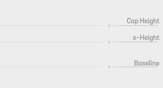
When creating lines for where a typeface is going to sit. We have 3 lines; Cap Height, x-height, and Baseline. There can also be a descender line underneath the baseline for the letters that descend under the Baseline such as; j, g, y etc. A useful tip I use when creating my line height for a lettering piece is what I have adapted as ‘The Rule of Thirds’. No matter how big your creating area is, the rule of thirds keeps your letters in perspective, even if you’re creating a piece for a 10 ft. wall, or a 1 inch sketch. It ensures that your letters stay proportional to the size that you’re creating.
Here are my lettering practice sheet templates with the line heights already created for you, ready to go – Lettering Practice Templates
‘The Rule of Thirds’ is a general guideline and not a rule of thumb, but overall, this is what has worked best for me when creating a proportional lettering piece. Sometimes using half measurements is effective, where the x-height is exactly in the middle between the Cap Height and the Baseline, making your Caps appear much larger and dominant in the overall piece. All of this is depending on what kind of artistic style you what you letters to appear. It’s entirely up to you.
The x-height gets its name from the height of the lowercase letter ‘x’ and its flat height. Rounded letters will protrude this height, such as the letter; c, o, s, a etc. I will go into more detail in future tutorial.
Typeface Styles
There are 3 main styles of typeface, each with distinct features; Serif, Sans-Serif, and Script. They each feature the same anatomy description, even if their appearances and features are different.
- Serif – A Serif style typeface is one with protruding lines on the ends of the letters. (The bottom of the ‘T’ in Typography anatomy image.)
- Sans Serif / Sans – Sans style typeface is devoid of these protruding lines on the ends of letters. Comes from the french, ‘sans’, meaning, without.
- Script – This style is a more fluid than the other two, has a handwritten aesthetic, and swashes or flourishes on the ends of the letters.
There are a few other typeface styles that you may hear of over time, such as decorative, display, non western, or slab. These styles are essentially spin-offs of the 3 main styles.
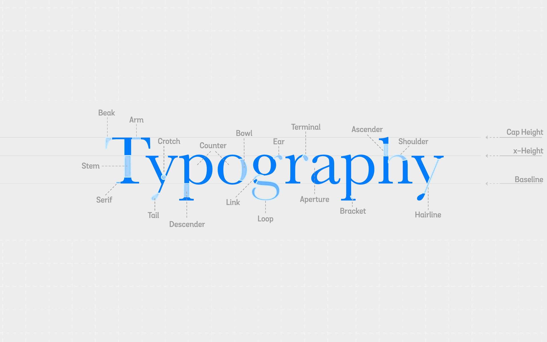
The Anatomy of Typography
Below is an image of the word ‘Typography. In this image you can see the parts that make up the body of a letter and each individual asset. Click the image to enlarge.
- Beak – The tip of a capital ‘T’, just after the ‘Arm’.
- Stem – The body of a letter, or the thickest straight line in between the x-height and the Baseline.
- Serif – The tips protruding at the end of a letter.
- Arm – Also called a ‘Crossbar’. Connects to an ascender/stem.
- Crotch – The valley at the bottom of a ‘V’ or ‘Y’.
- Tail – The point the protrudes passed a descender at an angle. The opposite to a ‘Terminal’.
- Descender – The part of a ‘Stem’ that descends the Baseline.
- Counter – An enclosed area of a letter.
- Bowl – The curved area of the main part of letter. Think of it as a curved ‘Stem’.
- Ear – Protrudes straight from the ‘bowl’ of a letter. Not connected to an ‘Arm’.
- Link – Connects the body of a letter to the loop.
- Loop – The curved area the loops around under a letter.
- Terminal – Similar to an ‘Ear’ but is connected to an ‘Arm’.
- Aperture – The opening to an enclosed area of a letter.
- Bracket – Connects the Serif to a ‘Stem/Descender’.
- Ascender – The part of a ‘Stem’ that ascends the x-height.
- Shoulder – A curve that connects ‘Stems’. ‘h’, ‘n’, ‘m’.
- Hairline – Diagonal line that connects letter elements. Think “A skinny stem”.
These are the most common parts of a letter that you will come across. Print this image out for future reference and pin/hang it up.
What to do now
- Print out the Lettering Practice Sheets and become familiar with drawing different letters, pick a font to start with. I use Baskerville. Pay attention to the shape of the letters. Practice multiple times, do 3 from tracing the letter to get it into your muscle memory, 2 more from looking at the letter in front of you but not tracing it, and finally do 1 from memory. Do this for each Upper and Lowercase letter in a font family.
- Study the anatomy of typography. To do this, take any word other than the word ‘Typography’ here and start to name off the parts of the letter. Understanding the individual pieces of the letter and being able to identify them in everyday words and situations is key to learning and knowing how type works and how you can improve your own type designs and lettering.


