There Is A Difference
There has been a resurgence in the popularity of type design over the last couple of years, and with any surge in popularity of a subject, some details can become unclear to those unaware of the practice or study.
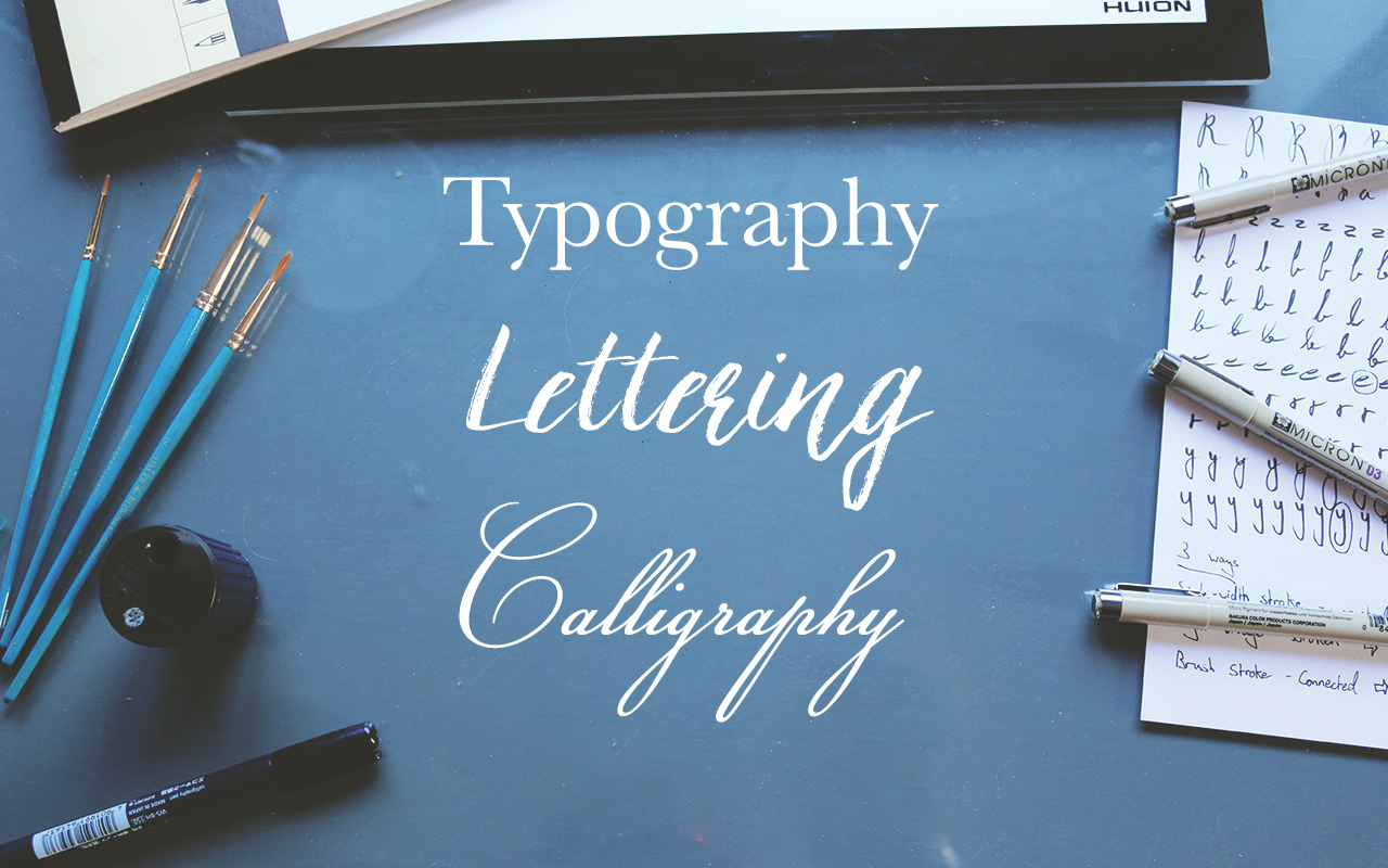
So, what is the difference between Typography, Lettering, and Calligraphy? For the average person, there isn’t that much, but to a professional, and a potential client, it’s important to know and use the correct terminology when discussing a topic as to be 100% clear and understanding of that person. As a professional so you are setting expectations to the client, and a client so you know what you are paying for to have created. Even if it’s basic knowledge, a little goes a long way when in discussion with a type designer or letterer.
There are a few differences between the practices;
Typography – is the act of setting type. The term was popularised in 1439 when Johannes Gutenberg developed the printing press and allowed a practical way of printing books, manuscripts etc., beforehand a book would have to be written by hand. A small metal slab of alloy, cut in the shape of a letter, was set into a moveable type machine where it printed letters exactly as the were set into it. Typography is used to describe the theories and principles of shaping and arranging letters. From Height, weight and shape, to the ‘Kerning’ (the space between each individual letter in a word), ‘Tracking’ (the space between all of the letters in a word) and ‘Leading’ (As in, the chemical element, referring to the space between a line of words).
Type designers are the people behind the fonts you select in Microsoft Word.
It is an incredibly skilled and time intensive field in which a professional can dedicate an entire career to. The skills, principles, theories and practices to master in the area of typography and type design are abundant. This is why you see typefaces and font families charging at €200.
Along with the principles of Typography, you also have the terminology of the character that make up the letter. For instance, ascenders, descenders, stems, terminals, ears, tails, bowls, counters, apertures, and more.
Typography is the study of how letters interact with each other in combination. Each individual letter is created to function in a repeat process according to principles and measurements alongside any other letter in any combination.
Lettering – is the art of drawing letters. Lettering borrows its principles and instills the theories of typography in terms of shape, weight, kerning etc. But is not intended to be used in a repeat process like typography. Lettering is used more as a display – a textual piece created using letters in an artistic way. Lettering uses strokes to ‘draw’ or ‘fill in’ a letter shape.
Although lettering and typography share the same principles and theories in letter forms, they are not the same practice. Lettering is created to be used in a once-off, artistic display eg. a logo, slogan, quote etc. While typography is used when creating headlines and body text.
For example, it would be completely impractical to letter every word in a book or novel. This is exactly what typography is used for.
Calligraphy – is the art of writing letters. It’s more closely associated with penmanship, writing a letter in a decorative style. The kind you see in religious texts, eg. The Book of Kells. Like typography it can be used as a writing style for bodies of text, and would have been used in holy manuscripts for intricate decorations. Calligraphy is a writing style, utilising single stroke techniques to achieve a letterform, unlike lettering which uses multiple strokes to draw a letter.
In 1439, the concept of typography was revolutionised with the invention of the printing press. Nearly 600 year later we still use the same principles and theories of type setting and arrangement to create typography now. The terminology coined back then including “Upper Case” and “Lower Case” came directly from the type setting process. Capitol letters were stored in cases above the regular sized letters, hence, “Upper” and “Lower Case”.
Not much has changed in terms of typographic principles since they were developed in the 15th century, only inventions that streamlined the printing process. Most notably, the Linotype machine, in 1884, which revolutionised the Newspaper industry. Efforts in typography were focussed on how develop processes that streamline what was still a time-consuming process. Then with the invention of the computer, the principles and theories are now applied in a digital format, and for the average person, typography is an autonomous process. But for the designer creating the font you are using. They spend countless hours learning and instilling those theories of typography from 600 years ago to create it.
It’s probably something you don’t notice. But good design isn’t meant to be noticed. That’s why designers aren’t celebrities.
Typography is a craft and skill passed down through centuries of knowledge and experience.
There are some other terms you may have heard relating to these topics, which you may think are interchangeable but are distinct on their own, such as:
Typeface – refers to the appearance of a family of letters.
Font – refers to the particular height or width of a font.
Logotype – which is a logo that consists solely of letters.
Handlettering – refers to lettering which is crafted by hand.
It’s important for a professional in the design industry to know the difference between the practices. Knowledge and skill is the key to confidence in your ability and professionalism in your work.